
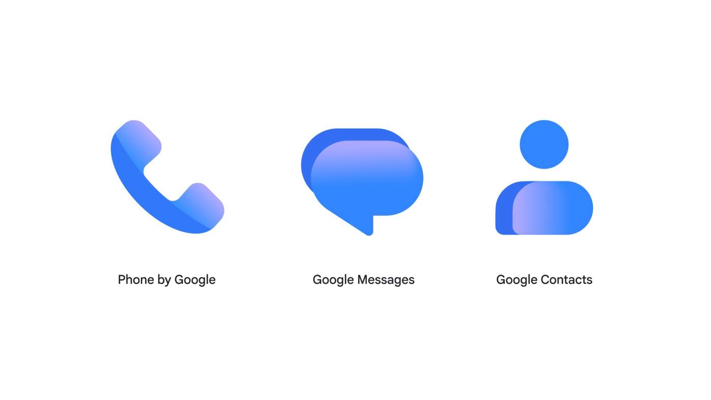

Google is now rolling out three new icons for your Phone, Messages, and Contacts.
According to Google’s whole post about it, the new icons are sharper and clearer on your home screen. You’ll notice the “crisp gradient” with easily readable edges. Here’s an excerpt from their announcement post.
The new icons are sharper and clearer on your home screen. For example, we’ve added a subtle but crisp gradient with easily readable edges. They also feature updated curvature and coloring to align with the rest of the Google apps you know and love, such as our core Google logo.
These icons are now rolling out to devices that utilize Google’s app icons, which should be most of them these days. Gone are the days of fragmentation, right?