Google Drive, Docs, Sheets, and Slides on the web are getting a fresh look in the coming weeks. Announced this week, Google is tweaking the appearance for the aforementioned services, moving features around, and simplifying the user interface for quicker finding of frequently used actions.
While Docs, Sheets, and Slides are getting the same set of changes, all of which are listed below, Google Drive is getting its own set of bullet points. For example, Drive is getting the ability to select multiple items at a time for performing batch operations for frequent tasks. Check out all of the changes taking place below for each service.
Google Drive Changes
- Key actions surfaced inline on files, for quick access and increased productivity.
- Ability to select multiple items at a time and undertake batch operations for frequent tasks.
- New search chips (including type, owner, and last modified) to help you find files faster.
Google Docs, Sheets, Slides Changes
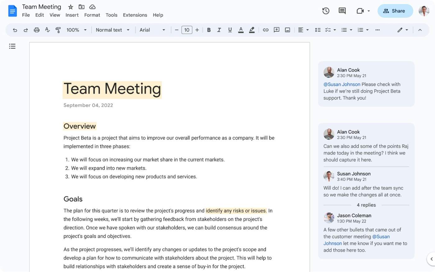
- A simplified user interface at the top of your docs, sheets, and slides, helping you find frequently used actions faster
- Additional user experience improvements in commenting, background, rulers, and gridlines.
- Note that while there are no changes in functionality, some features have been relocated to reduce clutter within the new interface. Notably, you can find the latest status info for the doc, such as last edit and version history, via a single entry point: the clock icon in the top right corner.
Google lists that it expects all end users to see these changes by the end of March, with rollout starting this week for users.