Seeing less info is rarely a good thing.
Before we get too deep into this and everyone freaks out, let’s make something clear: Android P Developer Preview 1 is the first preview of 5 as we get to stable Android P. That means Google can and will more than likely change a lot of what we are seeing in this first preview as people react, they take feedback, and their minds change from one day to the next. In other words, chill.
With that said, let me get a little pissy about the clock moving from the right side (where it has been for life) of the status bar over to the left, because it’s already bugging the hell out of me. Here’s to hoping this change is one that doesn’t stick around as we inch closer to stable Android P.
What’s the problem, you ask? There are many. Let’s walk through some.
1. The clock has been on the right side for as long as I can remember.
That’s me saying that Android users are trained to look to the top-right in order to see the time. Moving a basic piece of info that we have relied on being a specific location isn’t always welcomed. Not that I’m opposed to changes, this one just doesn’t seem to make much sense, which I’ll now explain further.
2. The left side is for notifications.
Not that anyone needed to be told this, but notification icons fill up the left side of the Android status bar. That’s how it has always worked. We know that we get status info and time on the right, as if the right side were the static info section of the status bar, and constantly-changing information on the left (like notifications that come and go). If you add a clock into that mix (static info), that shifts everything. Now, when you look to the top left, instead of simply dealing with the new information of which notifications are showing, you also have to consider time being there to add to what could be information overload. Do I start with the time or do I start just to the right of that to see notifications? Either way, there is a new piece of info in that area that you need to digest that I’d rather not.
3. The clock is taking up useful space here.
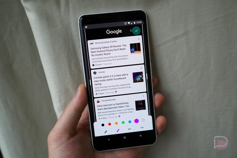
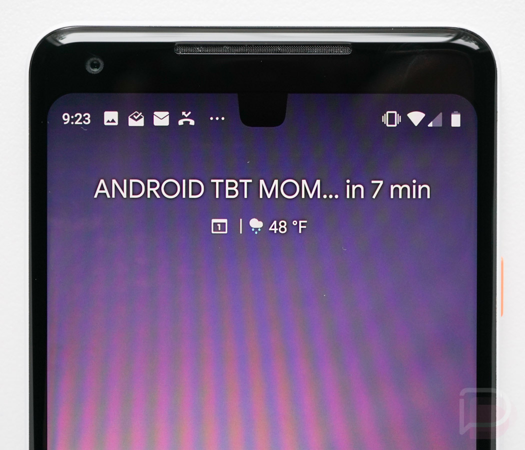
This might be the biggest deal of them all, but the clock on the left is now taking up space that could be used for notification icons. I’ll get to what this will mean for Android phones with notches in the next point, but as the image directly above shows, Android P is already limiting the number of notification icons we see, partly because of that damn clock placement.
See that? In this setup on Android P Developer Preview 1, I’ve got a clock, followed by 4 notification icons and then a “…” that tells me there are more notifications beyond what it is showing me. For comparison sake, I’m looking at my Pixel 2 running Android 8.1 right now and it is showing me a full 8 notification icons that I could check on. While it doesn’t have the “…” to tell me there are more, I still get 4 more icons than what P shows.
4. This becomes worse with notches.
Android P has built-in support for the wave of Android phones that will incorporate a top notch, mostly like the iPhone X’s, but also like Essential’s. With this move of the clock from right to left, I’m assuming Google was attempting to add some balance when there are no notifications, especially with a notched phone. That’s fine and I’m all for balance, but take a look at the three shots below that show off the three different notch versions that developers can build their apps for.
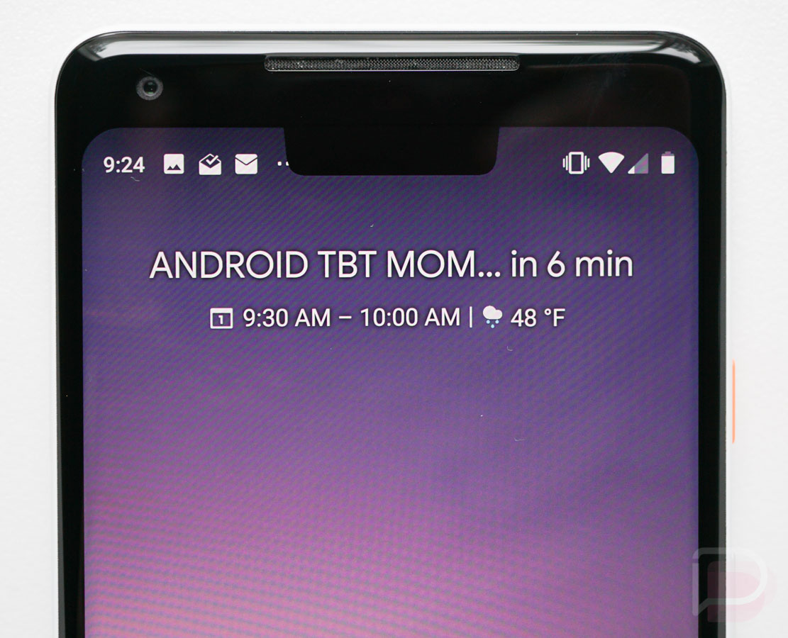
Obviously, this is a first version of notch support, but you can already tell depending on the notch size, how the clock move is really stressing the area for notifications. In two of the notch setups, you still get clock+3 notifications. However, in a wide notch, which we’ll probably see plenty of, you get a clock+3 notifications. That’s not very many!
On the flip side, that area with status bar icons has plenty of unused space in all of those notch versions. Why would we want unused space in an area that rarely changes and less space in an area that constantly changes? It makes no sense.
What’s the solution?
Not build notches into displays like Apple did? We could start there, since you know, it not only looks bad from a copycat perspective, it also clearly doesn’t work well with what Android has always been, which is the master of notifications.
Maybe we just need more control over how that area looks and works, in case we aren’t fine with Google’s current vision of Android P’s status bar? Or maybe we keep the clock and other status icons where they were, on the right side, and toss in the “…” if there are more of them than can be viewed on that side. I’d much rather see more notification icons than be reminded constantly with an icon that my phone is on vibrate or what my carrier network signal strength is when I’m on WiFi, not using a carrier network. Who needs to constantly see the NFC logo or Bluetooth icon? The hell with balance.