If you’re part of the Google Maps beta (and you should be), what I’m about to share may not be news for you, but to anyone not part of the beta, be on the lookout for a new look in Google Maps this week.
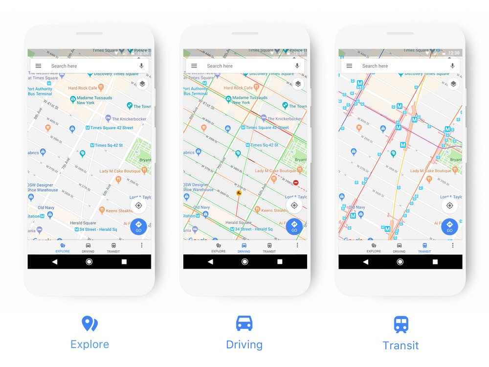
Detailed by the Google Maps team, they are changing up the driving, navigation, transit, and explore maps to, “better highlight the information most relevant to each experience (think gas stations for navigation, train stations for transit, and so on).” To help sum up the change, you will now have 3 selectable options on the bottom of your screen, one for Explore, one for Driving, and one for Transit. Inside these sections is related content, such as public transportation times (Transit), places to grab lunch (Explore), and more.
To go with this updated look, Google is changing up its coloring scheme a bit, and to help, they created a handy dandy cheat sheet. I don’t expect any of you to memorize all of this, but it’s good to reference, I guess.
You should see these changes over the next few weeks in all Google products that utilize Maps, including Google Assistant, Search, Earth, and Android Auto. Over time, the new look will also appear in apps and websites that use the official Google Maps API. If waiting isn’t your strong suit, sign up for that beta.
// Google Maps