For us who run this Android blog and for those that read it, the following news may not surprise you. In fact, it shouldn’t, so long as you kept up on the stories we’ve been writing for the past few months. This morning, YouTube made many UI changes official for desktop and mobile users, including the usage of Material Design, the Dark Theme, and proper scaling for easily viewing videos shot in portrait.
Let’s talk mobile first.
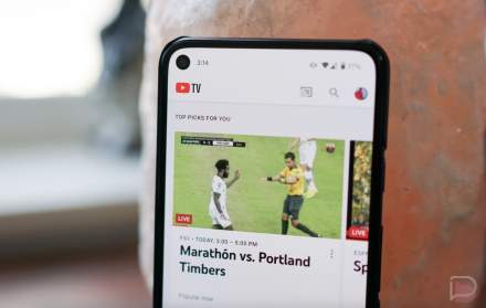
As you may have noticed, the navigation bar has been moved to the bottom, allowing for videos to take centerstage when you open up the app and its proximity to your thumbs. Library and Account tabs have also been added to this bar. While inside of the video, YouTube has created gestures, such as double taps to fast forward and rewind. These gestures are now available for everyone, along with the ability to select the speed of playback (o.5x, 2.0x, etc.).
As YouTube details in its blog post, “We’ve also been experimenting with new ways to display all videos in the best possible way. Soon, the YouTube player will seamlessly change shape to match the video format you’re watching, such as vertical, square or horizontal. That means you’ll always get the best viewing experience automatically – including vertical videos with no black bars on the sides!”
Personal note to anyone here who is still shooting video in portrait: Please, stop!
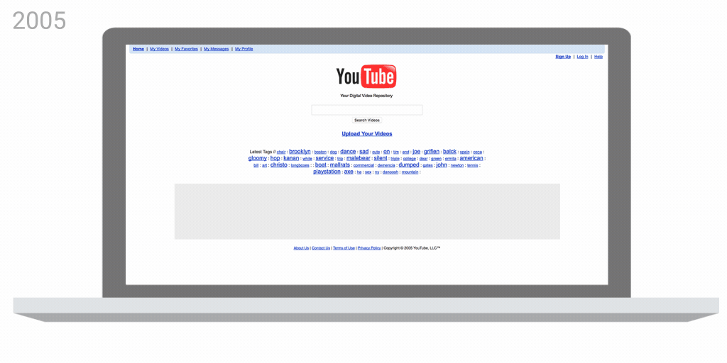
YouTube posted this GIF, showing the changes over the years.
For folks on desktop, the biggest change is the introduction of the Dark Theme. For the savvy among us, this has been available for months, but now no hacking inside of the dev console is required to enable it. Simply hit your profile picture in the top right, then select “Dark Theme.” Mmm, so hot.
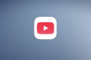
Last, but certainly not least, YouTube has a new logo. The “Tube” has been taken out of its red squircle, with the “Play Button” YouTube logo being moved in front of the name, providing a bit more flexibility for those on smaller displays. “When room is limited (say on a smartphone) you can use the brightened up Icon as an abbreviated Logo, which will be seen more easily and read more clearly,” YouTube explains.
Now go forth and consume all the cat videos!
// YouTube