The Pebble Time is an important product for a few reasons, but the most important is that it is the only serious contender for the space on your wrist besides Android Wear and Apple Watch. For most users, Android Wear and Apple Watch make more sense on their respective platforms. Really, the only reason the Pebble Time exists is because the original Pebble did a lot of what many users wanted in a smartwatch far before Android Wear and Apple Watch were a thing nerds argued about and normal humans looked at briefly as they passed through their mall.
Now that Android Wear and Apple Watch are here, though, can Pebble stay relevant with the Time?
This is our Pebble Time review.
The Good
The User Interface
Designing a fun to use, beautiful user interface is incredible difficult, but I think Pebble did a great job with this. They took a technology that Amazon has managed to make feel exhaustively slow and made it display text and iconography in a magical way. Text and icons fly on and off the screen, watch faces smoothly animate, and while the colors are limited, they feel native to the device. In short, the user interface feels delightful to use.
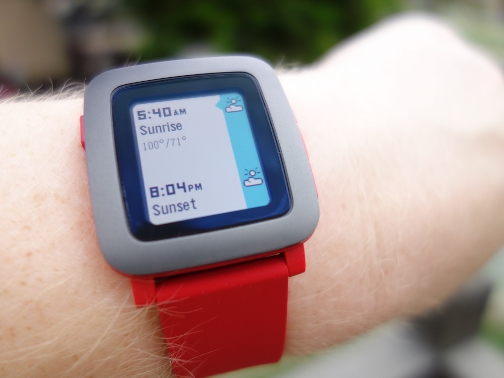
The new timeline interface is great, particularly if you schedule a lot of your life. With a simply press of the bottom button I can see what’s coming up next in my schedule, when and where. I can press the middle button when an event is at the top to see even more detail and with a press or two of the left button I’m back at right now with my watch face. I think that mental model works really well. Even if you don’t schedule anything you can use timeline to see upcoming weather and sunrise/sunset times.
Water Resistance
This may not be the most important feature to everyone, but I think it’s really nice to have a smartwatch that I don’t have to worry about taking off. Being able to just jump in the pool or rinse off after a run is pretty freeing. It’s also nice to know that if you have an Android phone and a Pebble Time you can still send voice replies to texts while you’re in the pool. Life changing? Maybe not, but definitely convenient.
Battery Life
Pebble still promises up to seven days of usage with the Time. My original Pebble never lasted for seven days and the Time still doesn’t either. With normal usage I think it’s safe to expect three to four days of battery life, which is definitely better than any other smartwatch available on the market. With that battery life come plenty of trade offs, but it’s there if that’s more important than, say, legibility.
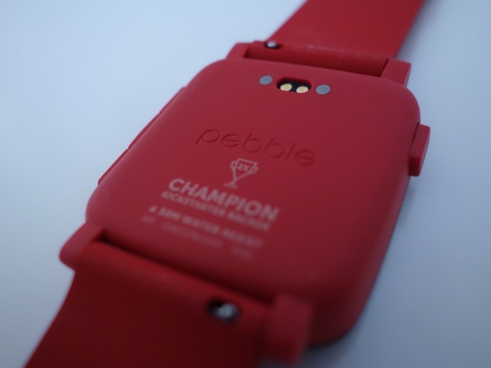
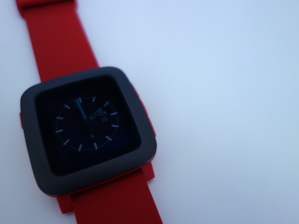
The Band
The band on the Pebble Time is great. It feels like it’s a slight revision over the original with more flexibility. I liked the band on the original and I like this one too. The really nice thing about the band is how easy it is to remove. Pebble added quick release pins, which means you can very easily slide the pins out and replace the band with something else. Normally you need a removal tool to swap these out and you will probably want one if you’re going to put a normal watch band on your Pebble Time, but at least the stock one removes easily.
Somewhere-in-the-Middle
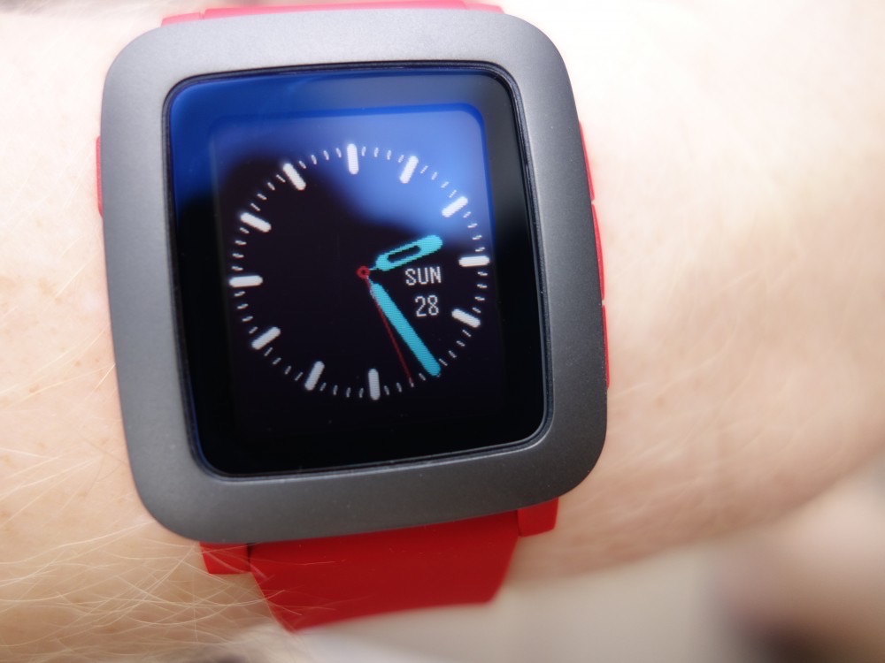
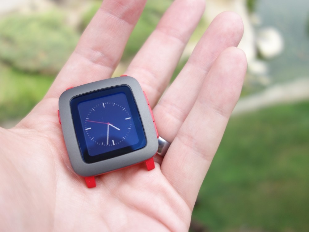
The Display Resolution
One of my biggest complaints with the Pebble and Pebble Steel was that the display had too low of a resolution. Pebble tried to make that work to their advantage by featuring iconography and watch faces that looked like they could have been taken from a Sega Genesis, but on any watch face that features a second hand (an important feature to many, including myself) it just looked bad. I don’t want to see pixels in 2015 and neither should you. The Time does not fix this issue at all, featuring a still too low for this age resolution screen of 144 x 168. While many watch faces look fine at this resolution (especially if they feature larger elements that don’t have many angles), classic watch faces and smaller information elements like the date or weather just look bad. Pebble uses a good font so everything is legible, but you never get the sense that this is something that is designed to look good, which brings us to the rest of the hardware.
Color Display
Pebble Time features a colored e-paper display (64 colors to be exact). This is an improvement over the previous displays in the right lighting, but its also a detriment in the wrong lighting. Because lighting is such a huge factor with e-paper displays, there are times when colors work against legibility on the Time. With the backlight on in the right lighting it makes watch faces look much more appealing and adds to the experience by allowing users to more easily differentiate different parts of the watch faces when allowed by the face designer. One of my favorite watch faces, TH3, allows you to change the color of the hour, minute, and second hands as well as the color of the dials, day, and date. That kind of customization is great, especially with colors, but I found myself limiting the colors I used because so often some of them made the face harder to read due to lighting.
The Hardware
I don’t want to say the hardware on the Pebble Time is bad, because it isn’t. It’s fine, but compared to something like the Moto 360 or the Apple Watch, its glaringly cheaper between its plastic body, dim, low resolution screen, and large bezel. While the battery life makes the Pebble Time a better fit for users who want longer battery life than the competition can offer, I wouldn’t wear the Time when I’m going to a function where I want to look good. Is that a problem for Pebble? Perhaps not if the Pebble was marketed more as a fitness device, but much like the original Pebble I don’t always feel comfortable wearing it in public because I’m not confident in its looks. It’s not just that it’s obviously made out of plastic, but also that it doesn’t look serious. I usually wear a $50 Seiko watch. It doesn’t look expensive, but it does look like a serious watch whereas the Pebble looks like a toy I got out of my cereal box.
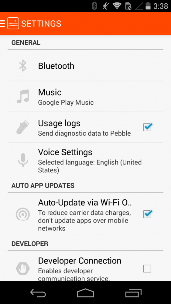
Pebble Time App
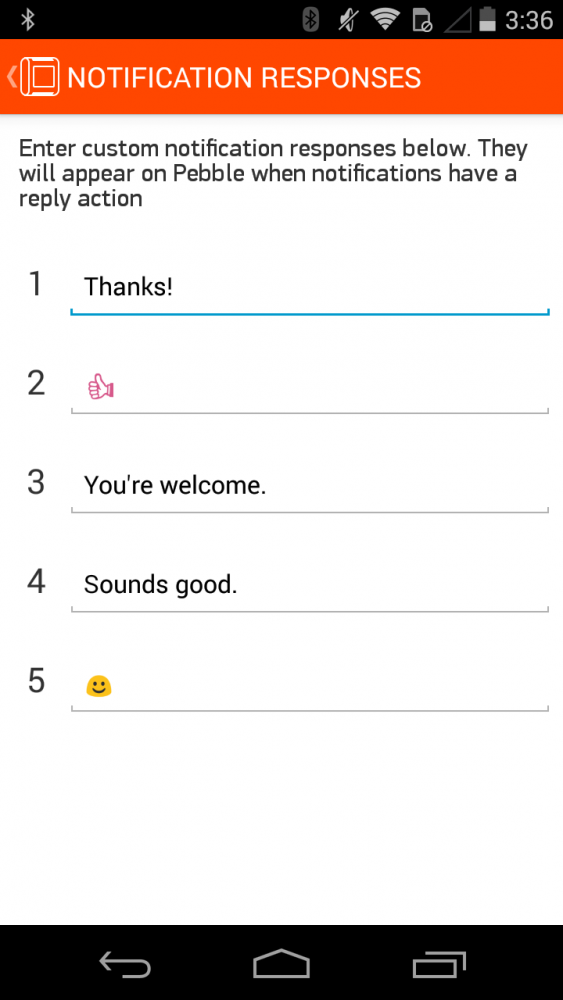
The Pebble Time app for iOS is useful for finding watch faces and apps, although it is a drag to use since it’s essentially a web wrapper. The Android app features a lot more functionality, but browsing apps and faces is still not as good as it should be. With the Android app you can set a default music player (which should be Google Play Music unless you’re a monster) and even canned responses for replying to messages.
Apps
Pebble has a small ecosystem of apps that allow you to use your watch instead of your phone, but like most things on the Pebble the functionality is limited. This isn’t always Pebble’s fault, but rather a limitation of what you can really do on a device this size. The best apps, not surprisingly, are fitness related, although there are some decent check list apps out there as well. Essentially, if you want to use a lot of apps on a smartwatch look elsewhere.
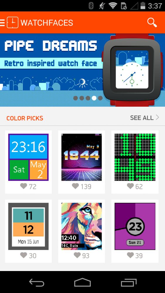
Watch Faces
There are some good watch faces for Pebble, but the vast majority of them are garbage. That’s to be expected when you have a free-for-all with the content created. The vast majority of apps on iOS and Android, for example, are garbage, too. I found myself using TH3, Revolution, and FIWatch most of the time.
[responsive_vid]
Voice Replies
In their launch video Pebble revealed a new voice feature which allows Android users to send replies to certain notifications with their voice (Pebble has promised this will come to iOS in a future update). Voice replies worked decently in my experience, but the lack of integration with Google Now or Siri (something Pebble says they’re experimenting with) means this is a function that will enjoy little use from most people. It’s also not nearly as quick and easy to use as demonstrated.
To use voice replies you press the middle button on a notification, select Reply, and select Voice (note: some Google apps like Hangouts require that you have Android Wear installed in order to use this feature). Pebble will then say that it is listening and you can dictate your response. After dictating, the Pebble will transcribe the response and display it to you before sending. If you’re good with the response you can press send. I adore the send animation (a paper airplane flying away). Several times I tried to send a reply it would say that an error occurred, but whenever I retried it would get it right. Some responses took longer than others to transcribe, but that’s par for the course for transcription. Every time it worked, however, the transcription was accurate.
For Voice Replies to be truly useful, Pebble should have implemented their own phrase to initiate a reply. As it stands you have to press too many buttons just to get to voice reply and then hope that it all works after that. At the bare minimum Voice Reply should be accessible with a long press of a button. Right now it’s just not seamless enough.
The Not-so-Good
Display Brightness
The display brightness on the Pebble Time is abysmal. On my drive home today my wife was calling me. The Time started vibrating and it was displaying who was calling, but I couldn’t see who it was. I shook my wrist, thinking the brightness might increase enough so that I can read who was calling, but to no avail. Finally I just looked at my phone, which was plenty bright so that I could see it was my wife and I answered the call.
There have also been plenty of times when the watch is simply illegible, especially in low light conditions. When you turn the light on in dark conditions the screen is easy to read and in direct sunlight it’s legible, but in low light and at various angles it is incredibly difficult to read. When I walked my dog this morning I was able to see the display fine, even in the shade, but in the office and on the drive into work it was very difficult to read, even with the back light on.
Display Glass
There are two problems with the glass. First, the glass is a smudge and fingerprint magnet. I’m constantly having to swipe the screen to improve its already abysmal legibility. Second, the glass is super reflective, which again, makes legibility difficult in certain scenarios. That’s going to happen with any object with a glass face, but it affects the Pebble Time even more than it ought to.
Display Lamination
Wow, Ron, you sure are talking about the display a lot. Yes, because it’s the most important part of this product and it’s not very good. On top of the poor resolution, brightness, glass, and endless bezels, the display is not laminated very close to the glass. Why does this matter? I want to look at my watch from multiple angles. When I’m typing with my Seiko I can move my wrist just a bit to quickly see the time. With the Pebble, I have to move it even more. Now granted, the screen brightness has a huge impact on legibility already, but if the display was laminated closer to the screen it was save me some millimeters when I need to glance at my wrist.
Video
[responsive_vid vid_url=”IZuYkpDsMxo”]
Gallery

The Verdict
So who should buy this watch? Most people should pass on this watch. If you use an iPhone you should absolutely not get the Pebble Time because none of the advanced features work on iOS yet and they may never work. If you have an iPhone, get an Apple Watch; you’ll be much happier. If you use an Android phone then the only reason you should get the Pebble time is if you want a smartwatch that lasts longer than Android Wear watches and you’re always in very well lit rooms or very dark rooms. In other words, most Android users would probably be happier with an Android Wear watch.
I enjoyed using the original Pebble, especially when I just wanted to know why my phone was buzzing, but it didn’t age well (mostly due to the plastic screen), I couldn’t wear it when I needed to look nice, and it didn’t integrate with my iPhone very well. The Time doesn’t solve any of those problems. Even though the Time is more capable on an Android device, the realities of using an e-paper display make it so difficult to recommend, especially when you get get an Android Wear watch that will look just as good for less money or better for the same or a little more money.
If Pebble had increased the resolution, changed the display technology or dramatically improved it, and worked with Google to make Google Now integration work then they may have had a compelling product, but as it stands it feels like Pebble just wasted their time for the past year. They had their opportunity and they did pretty well despite the limitations of the first Pebble, but I don’t think e-paper screens are the future of smartwatches, which means Pebble probably won’t be a part of that future either.