Google Hangouts, one of the most disappointing and frustrating apps of Google’s to use over the years, might finally be getting the UI overhaul we have all been waiting for. According to Android Police, who claims to have received Hangouts v4.0 a wee bit earlier than Google more than likely had hoped, the new user interface is quite improved. After looking at the screenshots they grabbed of the app, I would tend to agree.
As you all know, Hangouts in its current state is a disaster. It’s frustrating to use at best. There is this really awkward 3-column layout as your main screen (if you have Hangouts Dialer installed) that seems all sorts of unnecessary, an odd way to create conversations (especially group conversations), and a painful amount of steps are required to do certain simple tasks, like change accounts.
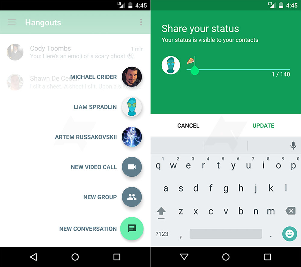
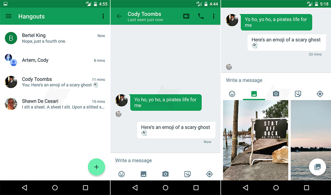
So what’s new in Hangouts 4.0? The UI is now much more polished than ever before. You now have a single-screen that shows you a list of conversations, along with a FAB that allows you to quickly create new ones (with recently contacted folks too), launch video calls, or create a group chat. Inside conversations, messages now have rounded corners, you have dedicated buttons for attachments like emoji, pictures, camera, stickers, and location sharing, and you can even set your status.
It looks miles better in v4.0 than it does in v3.3, which is what you all have now.
We have no idea when Google will release this, but hopefully, it’s soon.