One of the bigger changes in Android L that also shows off Google’s new Material Design came in the form of the new Dialer. Like many of the other features we have highlighted in the Android L preview, the Dialer still performs like a dialer, but it looks and is laid out better than ever. Gone are the multiple levels or outside pages, in is a design that seems like you can do everything without ever leaving a single screen. It is beautiful.
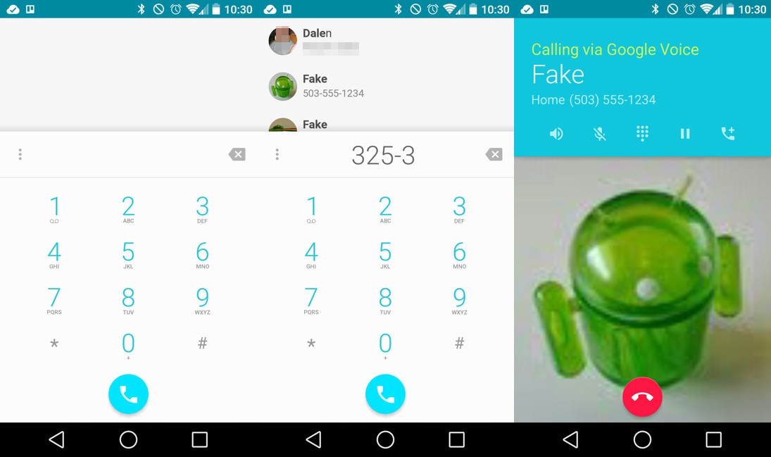
The first thing you will notice when entering the new Dialer for the first time, is that you have a single screen that allows you to get into recents, your favorites (“Speed Dial”) or an entire list of contacts with a swipe to either side. The number pad is only a tap away through a floating button that follows you between panels. The search box, which lets you search for contacts or nearby places, is also only a tap away and never not present.
In the last version of the Dialer that was released on Kit Kat, you had three impossible-to-hit buttons at the bottom that got you into some of these options, with no built-in swiping. As you tapped on options, animations suggested that you were opening different apps or areas that took you out of the Dialer. It was pretty terrible, to be honest.

The number pad has been restyled in Android L, but doesn’t offer much in terms of new goodies. You can search through contacts by typing out their name, which brings up a list of contacts. You can tap on those to then place a call. The best part about the number pad is the icon that follows you around the Dialer, before leading into a beautiful animation when pressed. This is Material Design.
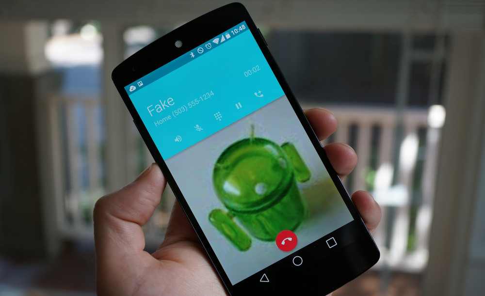
The in-call mode has changed, though. All of your buttons for things like speakerphone or mute have moved upwards in a card that includes the name of the person you are calling and their phone number. The only button at the bottom is the end-call button, which I personally do not like. Rather than displaying as a full red bar at the bottom of the screen that is easily pressed, it is now represented as a tiny red button that isn’t all that easy to hit. I am glad that they separated the in-call buttons from the end-call button, but would have loved to see the full bar stick around.
The settings menu has not changed from what I can tell, outside of its new skin. The in-call notification isn’t anything to get excited about either. A simple “Hang Up” button is all that you will see when in a call.
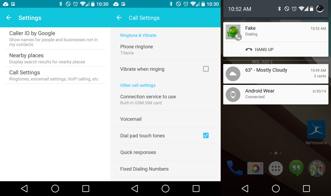
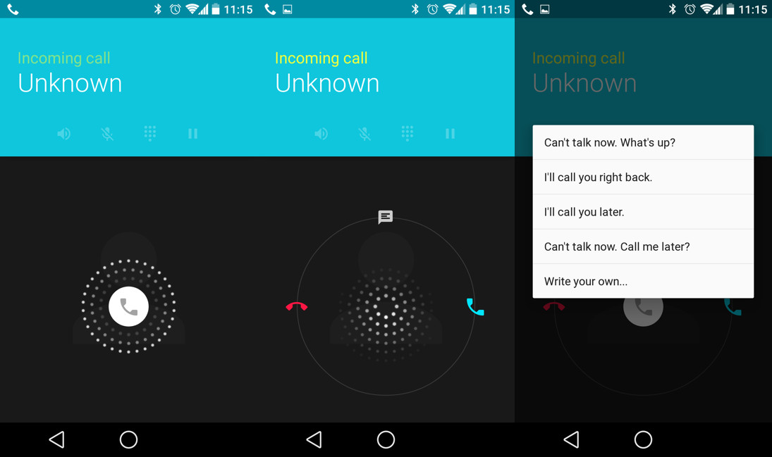
The incoming call screen has changed a bit. Just remember that blue is the new green when choosing which phone icon to swipe to for answering a call. Other than that, you have the same layout for the on-call screen, plus an option to swipe to pre-loaded texts when ignoring a call. Overall, it looks prettier as does the rest of the dialer when compared to Android 4.4’s.
And that’s the new Android L dialer. It’s pretty, redesigned, and all-inclusive.