
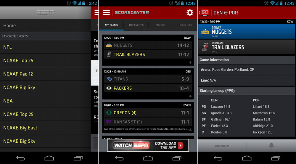
ESPN’s Scorecenter app received a major update today, one that includes a complete UI overhaul. As seen in the screenshots below, you now have a cleaner panel-to-panel viewing experience and an experience that no longer feels like it was built in 2009 as a direct copy of an iPhone app.
It has definitely been built with some of the new Android theme guidelines, including the side panel for additional options, and category options that can be accessed with a swipe at the top. Your “My Teams” tab still sits in the number 1 spot, followed by top events, videos, and big headlines.
It’ll take some getting used to, but it should make for accessing information from different sports much easier. In the past, you had to either pull up the bottom menu or swipe from column to column to access the non-major headlines. Now, a couple of quick taps get you there.
Cheers @MattLentz and @hiiankit!
