
See what I did there? While the rest of the world is spouting off in their best Honey Badger voice, “Oh my gosh, the Android is just sooo fragmented,” I took the other route. OpenSignalMaps posted this report that shows off the thousands of different devices that have downloaded and installed their app. They even used the words “fragmented” in their findings, however, I’m just not buying the idea that having multiple devices available is a sign of fragmentation. I look at it as choice. Oh who am I kidding, I’m really just sick of every non-Android site with nothing to write about, finding another reason to bring up “fragmentation.” The platform seems to be doing just fine if you look at every market share analytics report over the last 2 years. Again, I’m over it.
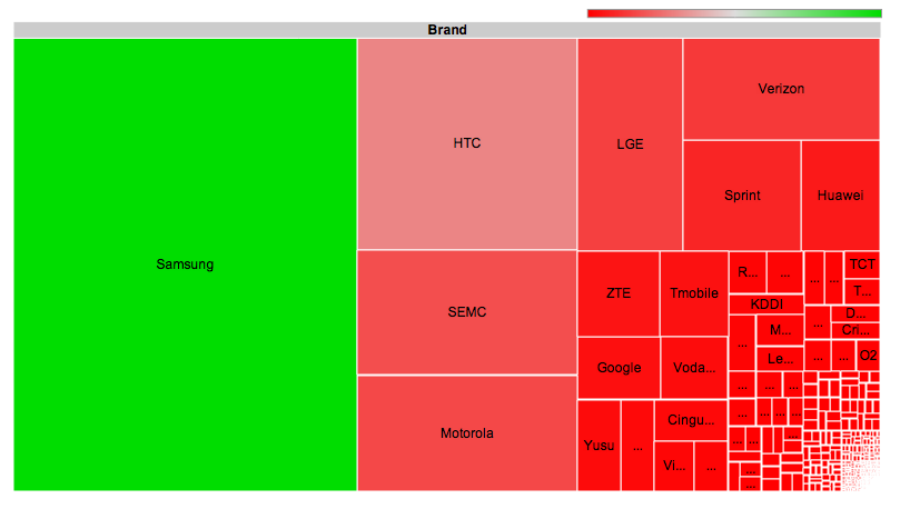
But hey, check out these neat charts! Samsung clearly has taken over the world of Android. HTC is a distant second. Verizon is the top carrier. ZTE somehow is smacking T-Mobile in the face. And AT&T is no where to be found.
If you hit up the source link, you can actually hover over each of those tiny boxes and it will tell you which phone, carrier or manufacturer it is. Have fun!
Via: OpenSignalMaps


