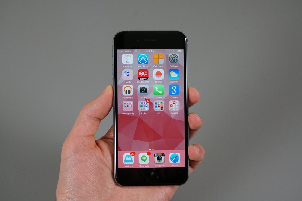
In short, the iPhone 6 is not the phone for me. Shocker, right?
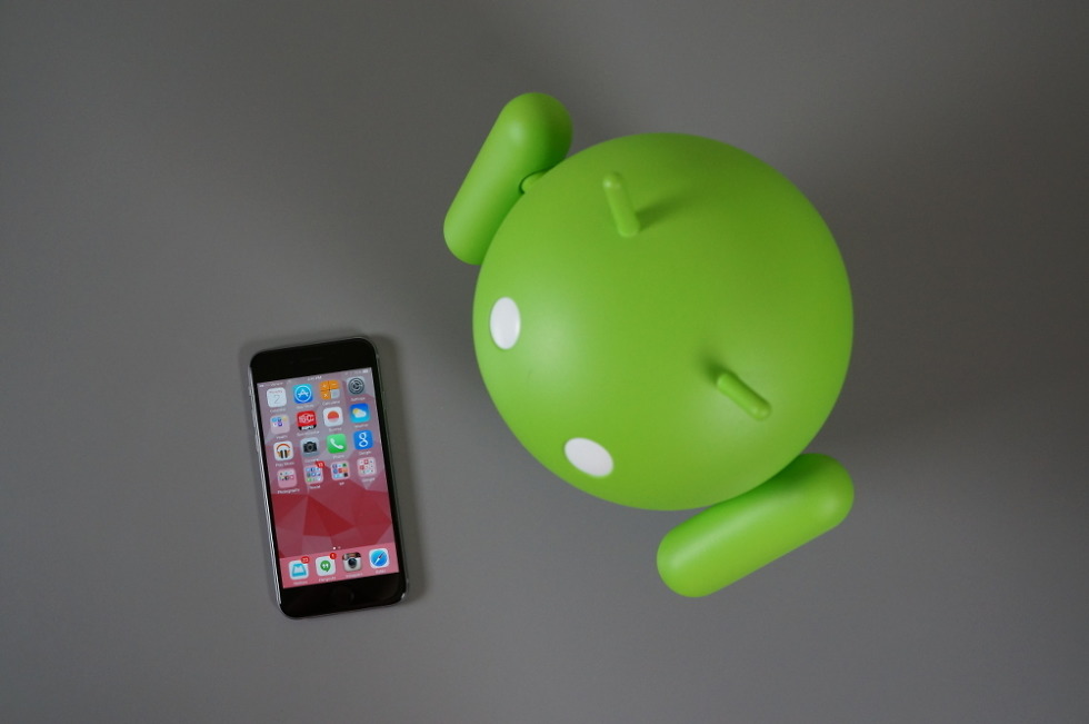
I spent the last two weeks with the iPhone 6 by my side out of both curiosity and to become even more familiar with Android’s biggest competitor. I have seen all that iOS 8 has to offer (at least at this point). I have experienced Apple’s finest. I have experienced Apple’s vision for Android. Yes, I just said that.
If there are two conclusions that I can take from this experience, it’s that I now understand why millions upon millions of people want this phone each year, but also that I am still confused at the obsessive, often times obnoxious, need for all-things-Apple, especially involving the iPhone. This is a nice phone, don’t get me wrong. However, this is not something to obsess over or to use as a prop to help you look down upon people who don’t own one. The iPhone is not a status symbol. You should not stand in lines for days to own one. It’s a really good smartphone – it just isn’t the best smartphone. It certainly isn’t running the best mobile OS.
Here are some final thoughts to put this experiment to bed.
Before we get going, understand that this isn’t an iPhone 6 review in the traditional sense. We aren’t an Apple site, so we aren’t going to start reviewing iPhones. Instead, these are some thoughts on the iPhone 6 and iOS 8 from someone who lives Android day-to-day, but spent the last few weeks with nothing but an iPhone. The sections in here will be comparisons to Android, what I like and don’t like about the iPhone 6 and iOS 8, and why, ultimately, Android is still what I prefer in a smartphone.
Initial impressions
[responsive_vid vid_url=”ZDb7VjXXxgM”]
Phone design
If I’m being honest, I have to admit that I tend to like most of the hardware design decisions that Apple makes with many of its products. I love the cylindrical style of the new Mac Pro, the sleek metal and now seemingly iconic design of the Macbook, and can even acknowledge that the iPhone 5 was gorgeous. With that said, the iPhone 6 is probably the ugliest, worst designed product that Apple has released in, well, years. Let me explain why.
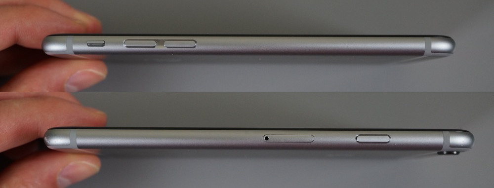
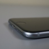
First of all, the rounded edges surrounding its body, coupled with its aluminum exterior make it incredibly slippery. Thankfully, the phone is on the smaller side when compared to flagship Android phones in 2014, so you can mostly get a full-handed grip on it. The iPhone 5 had a squared off metallic design, with the edges acting as gripping points, something a phone this size should always have. This is the same issue I had with the HTC One (M8), which also saw the flat edges from its predecessor removed in favor of a fully rounded body, a move that has little benefit other than for the company who made it to have bragging rights and for it to look extra pretty in pictures.
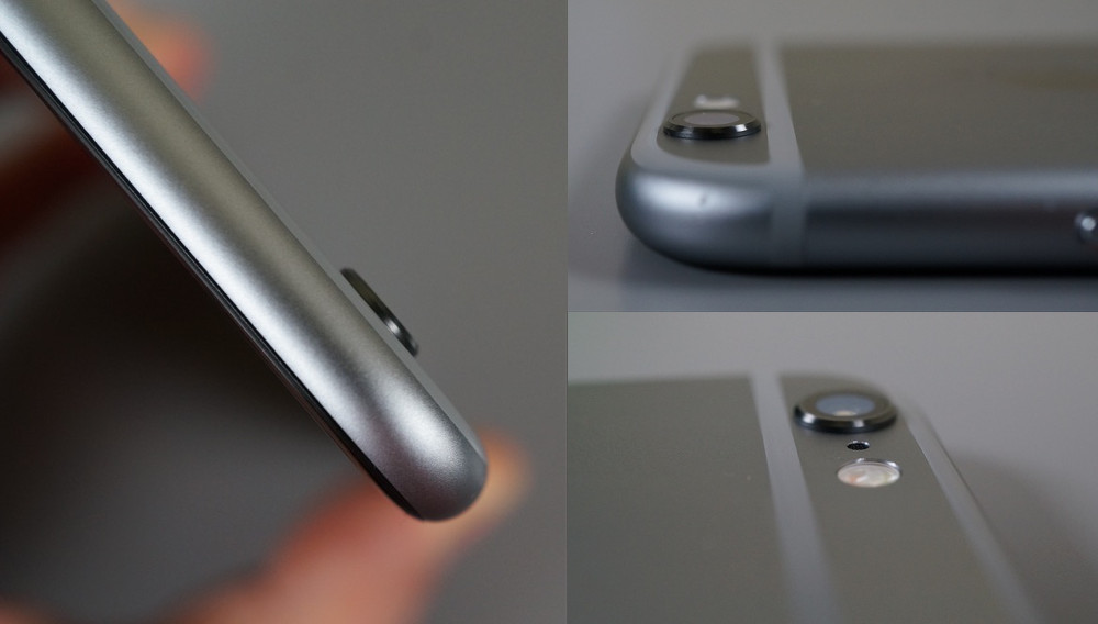
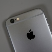
Second, Apple sacrificed all sorts of things just so they could say that the iPhone 6 is incredibly thin. For example, the camera on the backside of the device protrudes out from the phone’s shell. This is a terrible design decision for a number of reasons, most importantly though, because now your $650+ phone has an always exposed camera lens that will take the brunt of every collision. It also doesn’t allow the phone to lay fully flat and is the first piece of your phone that contacts any surface it is laid on. It is asking to be scratched.
But beyond the camera bulge, why is this phone this tall? To keep the iPhone 6 at an insanely thin 6.9mm and include their standard home button, Apple had to flatten it out, a move we wish they would have reconsidered. If you compare the iPhone 6 to the Xperia Z3 Compact, Galaxy Alpha, and last year’s Moto X, all of which sport the same size display (around 4.7-inch) as the iPhone 6, you might be shocked to see them sitting next to each other. Take a look at our comparison of the three on video. You would probably think that the iPhone 6 has a bigger display, but it doesn’t. The dimensions on the iPhone 6 are comparable to the new Moto X, yet it houses a 5.2-inch display. The Z3 Compact and old Moto X are almost 10mm shorter; all of those phones mentioned are not as wide.
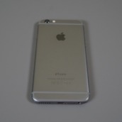
Finally, the backside of the iPhone 6, with its plastic lines and matching top/bottom panels is simply put, terrible to look at. From the first leaks we saw months ago, I kept saying to myself, “Apple can’t possible release a phone with that ugly of a backside.” And then they did. At least the previous iPhones that packed in panels offered some contrast with glass or different colors. The new iPhone just looks like Apple was trying to keep the familiarity of their previous designs and ended up settling because they wanted a unibody rounded frame instead.
If there is one design decision I will give Apple credit for, though, it would be in the rounded edges of the display. Like you will see on the new Moto X or the older Nexus 4, the iPhone 6’s display has been rounded off at all of its edges, which presents your finger with the softest swiping experience you can find. It also gives off the appearance that the display is floating, depending on which angle your eye takes to it.
In the end, to say that I came away disappointed in the design of the iPhone 6 would be a gross understatement.
Camera
There are two things I’m going to miss when I leave the iPhone 6 world and get back to Android – the camera and this phone’s battery life. I will get to the battery life in a second, so first, let’s talk about an amazing camera experience. If I were to describe the iPhone 6’s camera in two words, they would be “versatile” and “consistent.” Whenever I needed a shot taken, the camera was ready and more than capable. It’s also insanely fast in any lighting situation. While the camera only weighs in at 8MP, that is plenty of resolution for most. 16MP or 20MP just seems like overkill in a smartphone, especially if the smartphone can barely push quality in all those pixels.
As far as the camera UI goes, the iPhone 6 has the features and modes you need all at a swipe or tap away. It’s simple, that’s for sure. There are no manual settings that I can find, so if you want a deeper camera experience, you will have to download a 3rd party app. But if you just want to pull your phone out of the box, shoot quality photos, slow motion videos, or squared-off Instagram-ready shots, you can do that with ease.
As far as actual results are concerned, I can tell you that I am more than satisfied with the photos I was able to take. While I didn’t find myself in the ultimate photo situations during the last two weeks, every picture I took still seemed to come out as I had hoped. The iPhone 6’s camera shoots in a traditional 4:3, captures natural looking photos that aren’t overblown with saturation or high contrast or over-processing, and generally need little retouching depending on your needs.
I just always had confidence in the iPhone 6’s camera, which is something I can’t always say with many of the latest and greatest Android phones. That’s not to say that the iPhone 6 dominates all Android phones, I just feel like the camera has been fine-tuned to offer you a very consistent experience.
Battery life
The iPhone 6 sports an 1,810mAh battery that lasts all-day and then some. The new Moto X features a 2,300mAh battery, which Android users claim is “small,” and can’t last for more than 16 hours with typical use. I would imagine that Apple’s iOS deserves the credit here for maximizing such a small battery, likely at the expense of the fully-featured user experience we get on Android, but man, it has been a pleasure to use a phone that doesn’t look like a DROID MAXX and can still last beyond the night. In two weeks with the iPhone 6, it warned me once that I was below 20% or so and should think about finding a charger. Once. In my two weeks testing the Moto X, I needed a charger every night by 9PM.
Display
The resolution on the iPhone 6 is an odd one (1134×750), but I don’t think anyone in the world would complain at having to look at it on a daily basis. Apple has used an IPS LED display with a pixel density of 326ppi, a number that doesn’t match the top Android phones of the moment. It may not need to, though, because it’s gorgeous to look at. When Android phones jumped to 1080p, a few of us sort of realized that they had gone too far and that there were few benefits at that high of a resolution. Now, that has become the norm or base, while other manufacturers like Samsung and LG are exploring QHD. At 750p, which is a slightly higher-resolution than the Galaxy Alpha or Xperia Z3 Compact’s 720p resolution, you still aren’t going to see pixels with your naked eye.
Apple has calibrated the iPhone 6’s display almost perfectly as well, with as close as you will get to purely accurate colors, though it may show whites as being slightly cooler at times. I will gladly take cooler whites than the yellow, warm ones we see on devices like the new Moto X. The iPhone 6’s brightness level is also almost unmatched on each end of the spectrum, from ultra bright to extra dim.
I would also argue in Apple’s favor that the lower resolution has aided in the excellent battery life of the phone. With fewer pixels to push, you have less strain on that smallish 1,810mAh battery.
Finally, as I mentioned earlier, the display has a cascading effect around its edges, which helps deliver a softer finger feel as you swipe across it thousands of times per day. This also leads to a floating effect, where you feel as if the display is as close to the top of the glass as is possible. Apple did a great job with this display.
Macros for fun.
Apps and the Appstore
Apple bloggers will tell you all day, every day that the Appstore is far superior to Google Play. Is it? I haven’t seen anything in the past two weeks to prove that point. For one, the app selection is almost identical these days. Apple enthusiasts will tell you different, of course, but as of right now, I have two apps on my iPhone 6 that aren’t available on Android: Instagram’s Hyperlapse and Tiny Wings (because Tim made me). No other apps that are iOS exclusives have found their way on to my phone, because I’m not sure that many exist.
And here is problem two, when you talk about iOS and apps – the Appstore is a disaster. I talked about this the other night on the DL Show, but try searching for something like “best Twitter app” on both the Appstore and Google Play. On the Apple Appstore, you get Tweetbot as the top result, which is actually a popular Twitter app, but that’s the only one. The rest of the listings (in order) are an image framing app for Instagram, a game that looks like a kid’s Park Tycoon knock-off, an emoji app, another Instagram photo FX app, and a VPN service. Seriously, those are your options when searching for “best Twitter app.” Google Play, on the other hand, gives me more Twitter apps than I can even count.
It doesn’t stop there. The top charts section, I have been told by iOS users, isn’t worth looking at because it is easily manipulated. I was also told that the featured app collections on the main Appstore page are worth looking at, but Apple only updates those on Thursdays or something like that. There is an explore section, which in theory could be useful, except there are so many categories and sub-categories that it might take you hours to find a new app that is worth installing.
Google Play curates apps based on my friends’ likes and ratings and what I already have installed, but also puts together all sorts of lists of apps in a variety of categories from the newest to the most recently updated. If I want to find a new app on Google Play, or search for one, it’s as easy as doing a Google search. Or, I could take to each section where there are additional curated lists that aren’t buried behind categories and sub-categories.
As I mentioned above, Apple enthusiasts like to talk about how much better the app selection is on iOS, except that doesn’t mean a thing if you can’t find those exclusive apps. The only way to find new and useful apps that I can figure, is if you start reading Apple enthusiast sites. I think I’ll pass.
Using iOS 8 – the part where things get ugly.
If you read everything up until this point, your takeaway could be that I actually don’t mind the iPhone 6, thanks to its incredible camera, stellar battery life, and gorgeous display. Outside of a poor Appstore experience and what I would consider to be the ugliest iPhone in years, the whole package isn’t actually all that bad. But again, that would be the takeaway if you only read up until now. At this point, we are going to switch the focus and dive into iOS 8 for a bit. In other words, this is where it becomes clear that Android is still the smartphone operating system for me.
Performance
The iPhone 6, thanks to its 64-bit chipset, is a little powerhouse. The phone doesn’t stutter, apps load instantly, gaming is a joy, multi-tasking works as Apple expects it to, the camera loads within a split second, and even the Touch ID recognition of your fingerprint happens quicker than you would expect. If you look around the web at iPhone 6 reviews that include benchmarks, you will consistently see the 6 ranked towards the top in almost all categories when compared to other smartphones. The iPhone 6 is efficient, yet powerful.
Goodbye, silos…eventually.
Before iOS 8, your apps couldn’t talk to each other. If you have used an Android phone for more than five minutes, you know how big of a flaw that is. In Android, you can share anything to just about any app at any time from within any app. It’s amazing. In iOS 8, things should change for the better, thanks to the introduction of Extensions, which is an option that developers can build into their apps so that they can talk to other apps. For example, if you were looking at a photo in the iPhone’s Photos app, but wanted to edit it in Afterlight, you can now choose Afterlight as an editing option from within the Photos app. Previously, you would have had to exit the Photos app, open Afterlight, find the photo you wanted to edit, and then edit it. Another example would be sharing a web page. Going forward, assuming developers build in the functionality, you could share a web page and have it save to Pocket or send it through Mailbox as an email.
At this point, this functionality just isn’t there for most apps. Since the idea behind Extensions is so new and iOS 8 has only been available for a couple of weeks, we are still waiting for developers to add in support to their apps. As the days go by, we are seeing more and more apps gain sharing, widgets, etc., but it’s going to take time.
As I have been testing the iPhone 6, this has been a major pain point. For example, I use Feedly as an RSS reader and often email stories to myself. Unfortunately, Mailbox hasn’t built in sharing and I refuse to use iOS’s Mail app, so from within Feedly, I have no way to email a story out of the app. Again, things like this should be fixed over time, it’s just that this whole idea of sharing between apps has been a staple on Android from day one, that dealing with the slow rollout of support has been frustrating.
I need a back button.
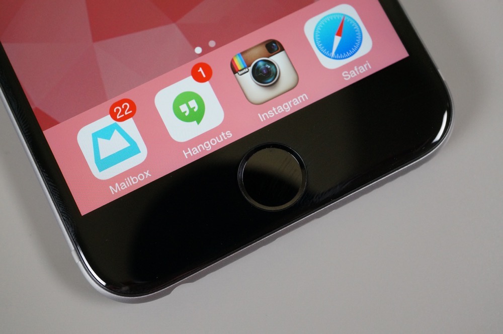
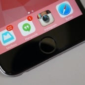
As you know, the iPhone only has a single navigation button – the physical circle home button at the bottom of the device. After having used Android for so many years, I truly have missed the back button. While Android’s back button has a mind of its own at times, it is more handy than I think most Android people realize.
Like, let’s say I’m in Instagram and find a link in a profile that I tap which takes me into Chrome. Well, the iPhone will only let me choose Safari, because…silos. Anyway, the link takes me into a browser on both devices. I then decide I have seen enough and want to quickly jump back into Instagram. On Android, a simple tap on the back button would take me immediately back to Instagram. On the iPhone, I have to double tap the home button to bring up the recent apps menu, hope that iOS quickly pulls up Instagram in a recent apps card menu since it was the app I last used, wait for the animation to finish, and then tap on Instagram. Inefficient much?
To be fair, iOS does utilize this nifty gesture where you can swipe from the left side of the display to quickly jump back a screen. It has been very handy to use and I almost wish that Android would adopt it. Unfortunately, this back swipe only works within apps – you can’t use it as a back button to jump back and forth between apps. Maybe some day.
The app jukebox.
There is no better way to describe the way iOS works than by calling it an App Jukebox. Android runs more like a traditional computer in that you have an accessible file system, real multi-tasking, apps that run outside of silos and can talk to one another, and almost unlimited access, assuming you know what you are doing. Apple doesn’t want anything to do with a scheme like that. Apple wants iOS to be an app facilitator, nothing more. The OS forces you to run an app to do this, another app to do that, and another app to do one more thing. Up until iOS 8, they didn’t talk to each other, you just went from one app, back home, and then to another. While we now have Extensions on iOS, the idea of running a specific app to do this or that still stands. You load your home screen, find an app, tap its little icon, close that app, find another, tap it, close it, tap it, close it, tap it.
With Android, there are apps that work within other apps or on-top of apps or next to apps. You have multi-tasking apps that can be accessed with a swipe, widgets that live on your home screen that do more than just display information, the ability to run multiple apps at a time in a multi-window environment, perform a quick task with a floating app on top of your current app, and maybe more importantly, life outside of the stock suite of apps that the operating system’s creator has forced upon you.
I am overwhelmed by settings…within Settings.
I talked about this in my “first impressions” video above, but the Settings situation on iOS is completely out of control. Rather than allow apps to host their own settings within themselves, Apple has decided that all settings will be controlled from a central Settings application. If you have a few dozen apps installed, your settings panel becomes overwhelming. Each app has its own settings menu within Settings, but it also has its own section within the Notifications section within Settings. Facebook has a settings menu within its settings menu within the Settings app. This is not a joke.
The settings situation gets worse when you include notifications in the conversation. Notifications are also handled individually per app through their own settings section within Settings. But so you know, you have to decide if you want each individual app to access all areas of your device, how many notifications to show, and how they should appear as they roll in. Again, you have to do this for each individual application.
The Settings app is also where you do things like set a wallpaper, turn on “Shake to shuffle” in the Music app, tell Apple Maps how loud the navigation volume should be, and add a second account to Twitter. You cannot do any of these things outside of the Settings app. I’m not making this stuff up.
Notifications
Speaking of notifications, they are both good and bad.
As I mentioned above, the notifications settings within the Notifications menu within Settings, isn’t my favorite setup. You have to choose within each app’s notifications settings if you want banners, no notifications, or pop-up alerts. You also need to choose if the app can even send you notifications, play sounds, show on the lock screen, and how many notifications you want to show in Notification Center. For the most part you really only need to tweak these settings once and can then forget about them, but the initial process is a bit much. Once you start receiving notifications, you may find that you need to go back in and re-tweak to get each app notifying you in just the right-but-not-over-the-top way, which again, is incredibly time consuming.
Similar to what I said in the Extensions section, the future for notifications is quite bright, we’re just not fully there yet. For example, apps will soon be actionable from the lock screen or as badges that show up at the top of your screen, but we need developers to build in that functionality. Again, it’s a waiting game for now.
My problems with iOS notifications are that they are everywhere, but they also do not seem to sync properly and you never know if or when they may hang around or leave as they should. This could be something that developers could yet again address, but for example, if I have already dealt with Mailbox items on my computer, I shouldn’t see notifications for those old emails on my iPhone that were dealt with hours ago. Same thing with my Dropcam notifications and “likes” from people on Instagram. But almost every time I pick up my iPhone 6, I have old notifications that I have already dealt with somewhere else.
Another issue arises when you dismiss a notification for later because you have to remember to check back for that notification. What I mean, is that there are no notification icons in the status bar that are constant reminders of items that need to be dealt with. On Android, while it may look cluttered and nasty at times, you have a status bar that constantly lets you know that you have pending notifications. On iOS, that isn’t the case – you have to swipe down your notification shade to see them or hope they are on your lock screen the next time you wake your phone.
I will say that I like how iOS groups notifications from the same app together in sections, with an option to clear all notifications from that app only. This is incredibly useful if you want your Instagram notifications gone, but want to see email or Hangouts notifications for a while as a reminder.
WTF, sound controls?
I don’t think anything about the iPhone 6 has been more maddening than trying to figure out volume controls. Apple has a Sounds section in Settings (of course they do), but it does very little. As you can see from the screenshot above in the Settings section, there is a single volume slider that controls both the ringer and alerts. The problem is, that it lies. I can turn my volume as low as it will go before going to silent and yet Hangouts messages still try to blow my eardrums out because they couldn’t care less what my system volume settings are. I have had this phone for two weeks and still cannot figure out how to adjust volume in Hangouts. How is that possible? Meanwhile, Android has separate sliders for media, alarms, and calls/notifications. Android devices also listen when you set them at a certain volume.
No personalization.
We like to host “Show us your home screens!” posts on a regular basis. Those days are used to show off the custom works of art that our readers have been able to construct on the home screen of their Android phone. They are without a doubt some of our most entertaining and popular posts. If we ran something similar on an iPhone site, it would be the most boring feature of the year, every time. There is no personalization with an iPhone outside of the wallpaper that appears on your home and lock screens.
I feel like with this iPhone, I’m using someone else’s phone and that I can’t actually make it my own. The only controls I have are how many apps I want in a folder, how many folders I want on a screen, and the arrangement of those folders and their surrounding apps. I guess I can add and remove apps from pages too, and maybe even place a widget on the notification shade or change the whopping four icons that sit in a dock at the bottom of the screen. There are no options for you to customize – this is Apple’s vision of a phone and they don’t allow you to change it. It is, as I mentioned earlier, an app jukebox.
Things that are great.
I know that I just spent all of that time talking about the things that I find difficult to deal with, but there are some good things going on in iOS 8. For one, if you are invested in Apple’s ecosystem, you have some amazing device-to-device sharing tools. Not only that, but your computer can become an extension of your phone, thanks to additions in Max OS X “Yosemite.”
Now, I happen to be running Yosemite on my Mac Pro, so I can do things like answer incoming calls on my computer (like you can do in Hangouts already), send web pages directly to my computer from the iPhone 6, send files instantly and make them available, or have all photos taken automatically backed up and ready in iPhoto within seconds. There are apps and features like this on Android as well, but Apple makes them incredibly easy to use in iOS 8.
I should also point out that if your core group of friends and family all use iPhones, I would imagine that iMessage (or whatever it’s called these days) would be a great messaging app. I do not personally know many iPhone users, so I haven’t even touched the app.
The Little Things
- Touch ID is great. Apple’s use of a fingerprint scanner in the home button of the iPhone is actually pretty great. It doesn’t require a swipe, only that you set your finger there for a second. You can use it to unlock your phone, pay for things, and authenticate without needing to type a password. It works almost flawlessly. This is not that gimmicky swipe fingerprint scanner that Samsung continues to try and use – this is a legitimate fingerprint scanner that works practically every time you use it, no matter which part of your fingerprint is touching it.
- Lightning cable is too. Apple uses a proprietary charging cable (Lightning) that blows away the micro USB cable that all of our Android phones use, because of one thing – it’s reversible. When I go to bed at night and plug-in this iPhone 6, I no longer have to worry about which way the cable is facing. I grab it, plug it in through the dark and go to bed.
- Call quality, not so much. I rarely mention call quality in reviews because most phones these days all sound great. With that said, the iPhone 6 actually stood out to me as having poor audio quality when on a call. Not only does the volume not get loud enough, but conversations often sounded tinny or robotic.
- Bing all the things. If you want to perform a quick search on an iPhone, you can do so through a simple swipe-down when on your home screen. Once swiped, a search box appears that allows you to search for anything that is on your mind. In iOS 8, you can now do more than just perform web searches; you can search for apps, contacts, movie listings, wikipedia, and more. The idea and implementation are quite useful, except for one thing – the search uses Bing instead of Google. Have you tried searching for anything on Bing lately? Save yourself, it’s still not any good in 2014. Edit: I have been informed that you can change the search setting to use Google instead of Bing. Probably one of the 8,000 settings I missed.
Gallery
Wrap-up
My experience with the iPhone 6 ends like I expected it to. The phone was impressive in battery life, camera, display, and performance categories, but I was ultimately left frustrated by the intricacies of iOS 8 that differ from Android. From Settings and Notifications handling to the silos that still exist while developers get their apps ready for Extensions to that damn physical home button. It’s obvious that Apple has created an experience that they feel is the best for everyone, except they forgot about the tinkerers of the world and those of us who want ultimate control, who want to customize a phone’s experience, and who don’t want to be told that their phone should be used a certain way.
The iPhone 6 and iOS are consistent – they just aren’t consistently what I want.
On to the Xperia Z3 Compact.






Collapse Show Comments551 Comments