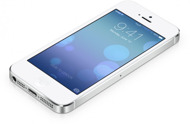
On Monday, Apple revealed the latest version of iOS to the press and developers at its annual World Wide Developers Conference. Apple showed off a lot of new features on iOS, many of which are iterations on ideas from other companies. Unsurprisingly, I saw a lot of people complaining on Twitter that Apple was claiming to reinvent everything and that they stole everything from Android. The truth is that they took ideas from Android, webOS, Windows Phone, and a handful of jailbreak tweaks and, most importantly, iterated on them. Apple didn’t claim to be reinventing anything (they’ve avoided that claim for years now); instead, Apple claimed to be iterating. iOS 7 really is the biggest change to iOS since the iPhone was released in 2007.
Influences and Theivery
I think iOS 7 looks like a balance between webOS and Microsoft’s design language (which I’ll call Metro, like everyone else outside of Microsoft). It is not completely flat and squared off like Metro, the UI is not multitasking-based like webOS, and it doesn’t fit content into cards like Google Now (and Google+, the Play Store, Google Play Music, etc.). While Android fans have often complained about Apple stealing ideas from Android, this version of iOS seems to be devoid of influence from Google in terms of design.
In fact, if there is any clear influence in terms of design, it is clearly coming from Redmond, not Mountain View. Google’s emphasis on using cards to show content, a dark and bright color palette, and the free-form organization of content through cards give Android a very different design language. Android’s home screens and apps feel more like a messy desktop (that can be cleaned up) compared to iOS’ restrictions on how information and apps are displayed. Apple absolutely stole some ideas from Android (calling live wallpapers “dynamic” isn’t exactly innovating), but the majority of the changes made by Cupertino are clearly influenced by webOS and Windows Phone, not Android.
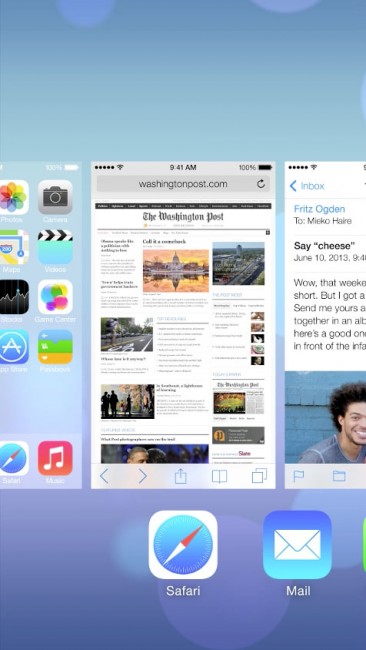
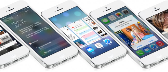
To see this clearly, look at the lock screens on webOS, Windows Phone, Android, and iOS. On the lock screen, largest similarities are from webOS, especially with the way that notifications appear on the lock screen. Apple’s new version of multitasking in iOS 7 is even more blatant. Instead of doing half the work like Microsoft did with Windows Phone and instead of shrinking down the cards and swiping from the x-axis like Google did with Android, Apple straight up copied Palm’s implementation of multitasking and added app icons.
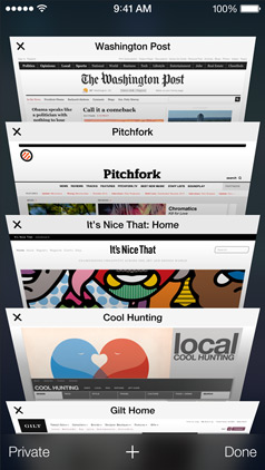
iOS 7 isn’t just influenced by webOS and Windows Phone, though; Android’s donations are clear in a number of areas. Notification Center is still, for all intents and purposes, a crummy version of the Notification Drawer in Android with a few cues from the Me tile in Windows Phone. AirDrop is essentially the same thing as Wifi Direct, DLNA or NFC sharing (sans the bumping). Quick Controls is similar to Quick Settings except it has a heavier emphasis on media and looks more like a messy jailbreak tweak that Ive’s team mocked up in Photoshop for 10 minutes and then coded the night before WWDC. Tabs in Safari is a complete rip off of tabs in Chrome (although I will say that Apple’s version of it makes differentiating between tabs much, much cleaner).
Layers Beneath the Glass
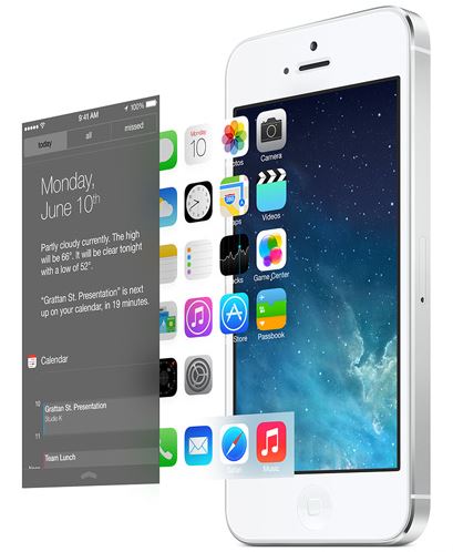
iOS 7 uses transparency, shadows, and parallax to communicate depth and layers. When you unlock the phone, the whole lock screen slides to the right and then the icons fall on top of the wallpaper. Regular wallpapers will shift on a z axis behind the rows of apps to show that the apps are floating above a layer above the wallpaper (parallax). Quick Controls and Notification Center slide over the icons in a translucent shade to show that the home screen is behind those features. The result is that the iconography and typography may appear more simplified and refined, but the OS itself does not.
The use of translucency throughout the system gives iOS 7 a depth that Android, Windows Phone, and webOS lack with their purely digital implementation of the GUI. While each OS has pull down menus and notifications that hover over content, they use solid, flat colors and little to no depth, which makes each layer feel more like stacked sheets of paper than panes of content that are hovering over one another. This use of layers, translucency, shadows, and parallax leads to an operating system that looks and feels more real that the skeumorphic aspirations of iOS 6 could ever accomplish. The shift is subtle, but important. Instead of trying to make content and features look and feel real by making them ape physical object, iOS 7 adds layers of depth perception to make them feel like they exist on separate levels beneath the glass.
Balancing Borrowing with Innovation
Apple, like Google and Microsoft, is good at taking ideas and iterating on them. I cannot emphasize this enough: companies do not come up with every idea on their own. Google, Microsoft, Apple, Palm, Blackberry, Nokia, HTC, Samsung, LG, and Motorola all design software and hardware that is based on designs and ideas that come from elsewhere. Objectivity doesn’t exist; we are all influenced by the things we see, read, hear, smell, and touch.
Xerox essentially invented the mouse and the GUI, but Microsoft and Apple have been refining both ideas for decades through mouse hardware and Windows and OS X respectively. Apple didn’t invent the smartphone, but they dramatically changed the way we thought about smartphones and what they can do. Android was designed to take on RIM and Microsoft; when the iPhone came out, Rubin and his team adjusted course to compete with iOS. Everyone looks at their competition, examines their iterations on ideas and concepts, and either steals them or improves upon them. Some people call that preparations for patent lawsuits, others see it as how innovation works.
As iOS 7 gets closer to release and discussions about its design and features continue, I hope Android, iOS, and Windows Phone users (and the 12 webOS users left) recognize that every OS builds off of the ideas of its predecessor. Whenever someone mentions something that Android borrowed from iOS, Android fans get upset about it and insist that Google did not just take the idea; they iterated on it and made it their own. For the most part, I think that’s what we’ve seen Apple do as well. Every company does its fair share of stealing and innovating. We can sit around and be upset that companies steal ideas from each other, or we can continue to be inspired and buy products from companies who are working extremely hard to compete with each other to make some of the best products we have ever seen.
I’m excited for this new direction with iOS. I think Apple did a great job overall in changing the look and feel of the OS without abandoning its familiarity. Between Holo, Metro, and iOS 7 I think we have three really great design languages that borrow from each other while continually iterating and competing to make the best mobile operating system. I can’t wait to see how iOS 7 influences Microsoft and Google to continue to innovate and improve their respective products.
Collapse Show Comments203 Comments