Over the last week, we have seen our fair share of purported leaks for Google Babble, the supposed all-in-one unified messaging service from Google. Most appear to be silly mock-ups or guesses that take into account certain Android design guidelines here or there, but few are believable. And then there is the mock-up pictured above, posted by a media designer at Dutch site Skloink. While we wouldn’t suggest that you buy into this as being the real deal (we’re not), it’s the closest we have seen to what we would envision a unified Google messenger service looking like.
First, it looks a heck of a lot like Google+, which makes complete sense. Google is trying everything in their power to get users to make Google+ a part of their lives, so taking design language from that app and then pushing it into a unified messaging is probably the right call.
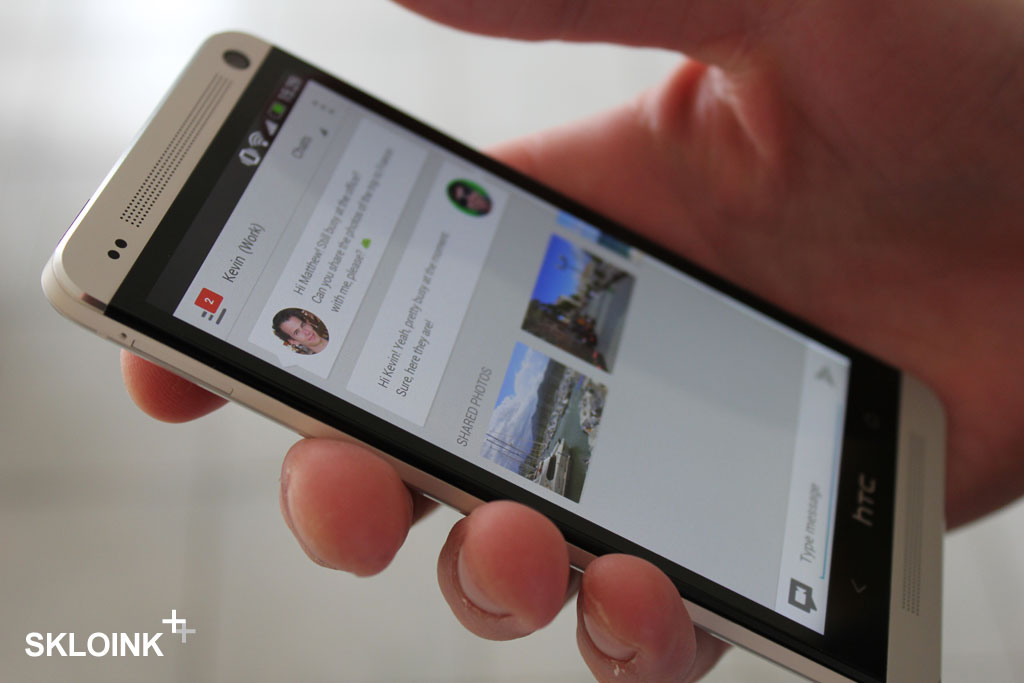
We’re also seeing Google Now-styled cards that separate conversations (like we have seen in Google Play 4.0), along with a “Shared Photos” section that we would assume means photos recently shared between you and that person. There is a top left menu button that shows an unread conversations count, a drop down which reads “Chats,” Hangout button in the text area, and images that appear to be pulled directly from G+ profiles.
It’s very polished.
We’re still confused at the supposed name of “Babble,” but if the finished product looks anything like this, we’d forgive Google.
Via: Skloink
Cheers Derek!
Collapse Show Comments74 Comments