During Google I/O 2014, we saw the beginning of a new set of design guidelines take shape in the form of Material Design. Google wants all of its products across all platforms to look a certain way, with layers, depth, motion, and even a sense of texture or the feel of touch as you swipe around something like Gmail. But even though Material Design was unveiled, the only instances of it in the wild at this point are some of the stock apps built-in to the Android L preview. We have yet to see Google give us fully redesigned Maps or Hangouts or Calendar apps. Sure, Google+ saw a massive redesign a couple of months back that took on parts of Material Design, but it even has some work in front of it to look like what was shown at I/O.
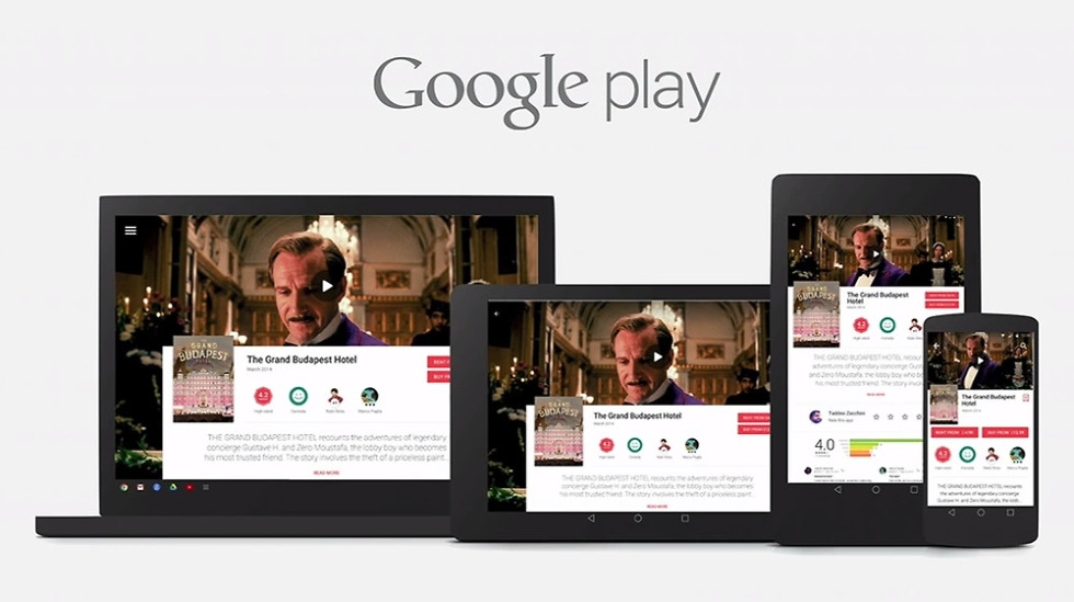
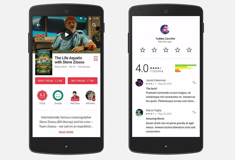
Thankfully, they gave us all sorts of glimpses of the current work being done to Gmail and even Google Play. The Gmail mini-preview was shown during the keynote, but if you looked at the specific developer sessions for Google Play and Material Design, you got an entire preview of what the new Play store is going to look like. From the massive content being displayed in backgrounds or at the top of listings, to the simpler layout that feels less cluttered, to sharing and purchasing buttons being easily identified, this is going to be a major change.
If you jump to the 12:30 mark in the video below from that I/O session, you will see the new Google Play in action on tablets, phones, and in the browser. Or if you don’t have time for that, the header image at the top of this post gives you the new Google Play in all formats. Pretty cool, right?
According to the folks over at Android Police, Google is already testing a Google Play build with partial Material Design on devices. I would imagine it is being dogfooded internally, so no, you won’t be able to grab an apk or install it early. Instead, the screenshots they have seem to show Google taking baby steps towards making Material Design a part of Play. You will see bigger content, but then also the familiar green buttons in apps pages. There is going to be a bigger contrast on pages with white backgrounds and black text, along with bigger, more obvious share, +1, and wishlist buttons. Maybe this will be Google’s attempt at taking us through this massive overhaul one step at a time, or maybe this build will never surface publicly. It’s tough to tell.
Again, check out the video below to see where we will eventually be, likely this Fall.
[responsive_vid]
Collapse Show Comments31 Comments