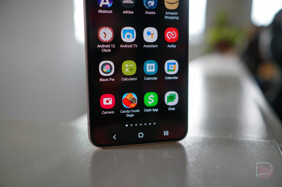
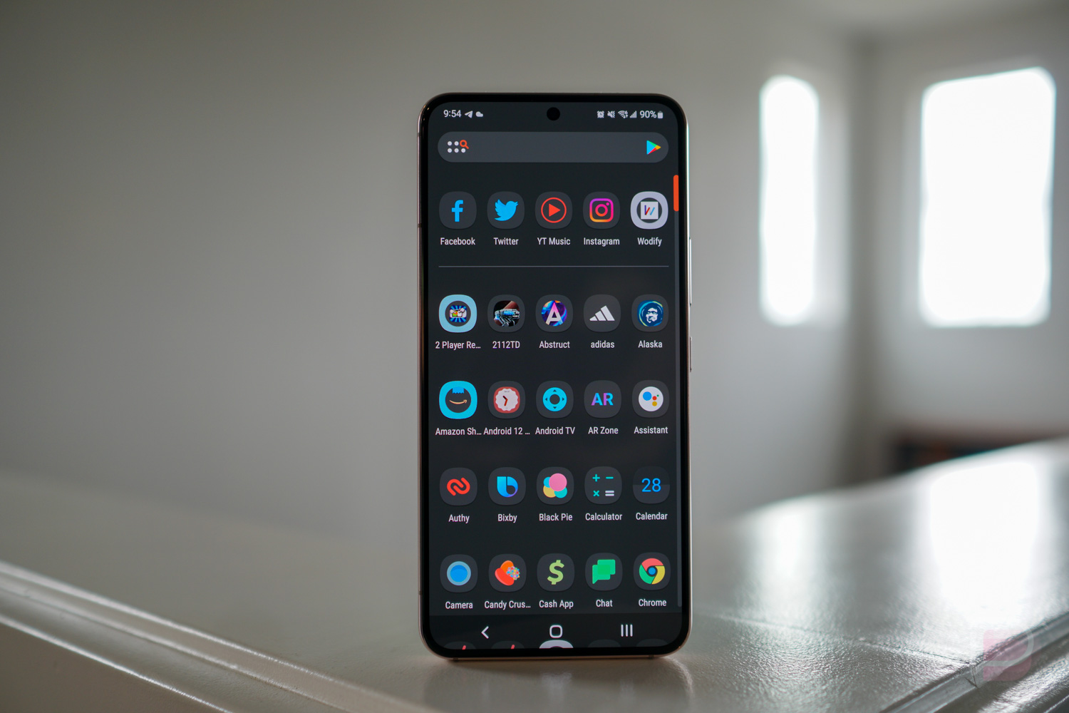
As the headline reads, we’re now beginning a campaign for Samsung to change its current app drawer from a horizontal, paginated layout to a vertical layout.
As it currently exists, to look through your app drawer on a Samsung device, you swipe up into the drawer, then proceed by changing your swipe direction to left/right for scrolling through the apps you have installed. For me, with quite a few apps, I have seven pages (4×5 layout) of apps to swipe through. That’s probably not even a lot of pages compared to other people. Since it’s still technically quicker for me to swipe 7x to get to my apps on the last page, apps like Yummly and YouTube TV, I do that rather than using the search bar on the top of the app drawer UI. That doesn’t make it good, though. It can very much be improved.
The Case for a Vertical Drawer
I’ll make this real easy to understand. If I swipe up into the drawer, it makes sense to me that I could simply continue swiping up to scroll through my list of apps. Why the change in swipe direction? Additionally, a vertical layout allows for quicker access to apps, especially if a letter-powered directory is added to the right side of the drawer.
Heck, at least give me the option to choose between vertical or horizontal. Samsung’s launcher has plenty of settings to go through, but a vertical drawer is not one of them. I can’t imagine it would be that difficult to implement the option. In that same breath, I’d like to note that every other Android OEM has a stock launcher with a vertical app drawer. Samsung appears to be the last holdout with the horizontal app drawer.
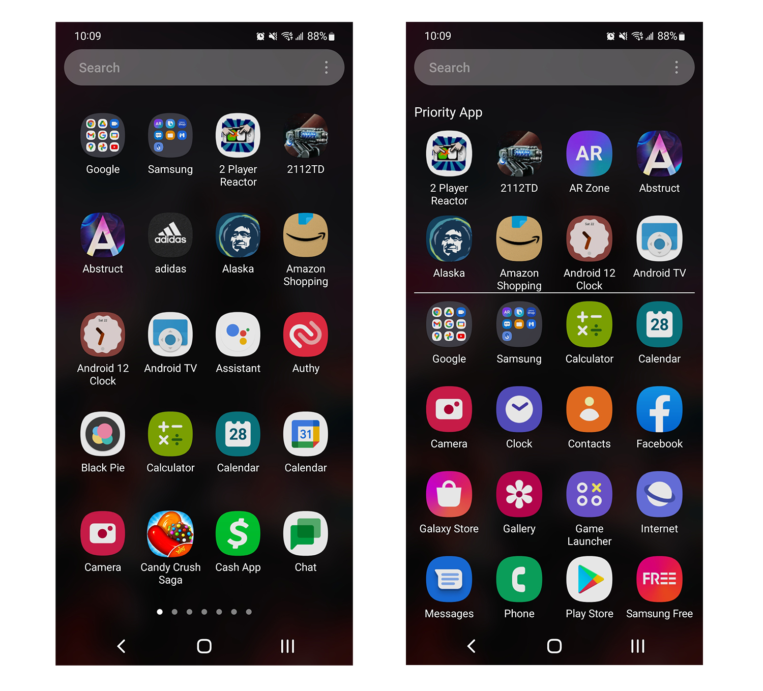
Stock vs. Good Lock
What About Good Lock?
Good Lock is an app for Samsung devices, allowing for a lot of customizable options, including one that brings a vertical option to the app drawer. The problem? It sucks. When enabled, it includes two freakin’ rows of recommended apps, which doesn’t help me and doesn’t look good. Case closed on Good Lock.
Kellen additionally pondered if the launcher experience would be better if it remained horizontal, but wasn’t paginated. That doesn’t sound enticing to me, but my main focus is limiting the amount of swipes it takes me to get to apps that start with letters near the end of the alphabet. In my current layout, 7 swipes to get to the end? That seems time wasting and ridiculous.
Until something is done, I’m sticking with Nova Launcher, which isn’t even a great alternative currently due to the mess that is native Android navigation gestures and 3rd-party launchers. That’s a story for a different post.
Your move, Samsung.


Collapse Show Comments58 Comments