Last night, theScore Sports, a sports app that has been one of the best (the best in my opinion) for a number of years now, received its “biggest update ever.” The update is also not being received well by its users, with many already looking elsewhere for their sports info. In fact, the Play store listing for the app is now filled with a bunch of 1 and 2-star ratings, all of which are complaining about the new UI. The reviews are so bad right now you’d think theScore’s update included a permanent national anthem kneel.
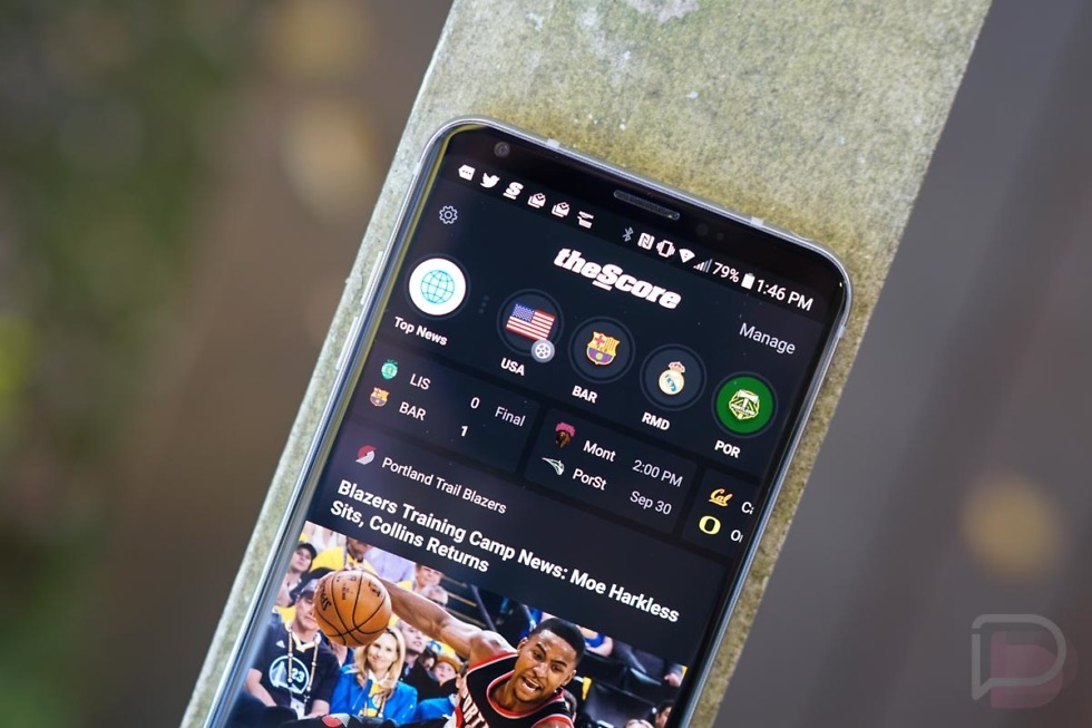
So what’s wrong with the app now? Obviously, the update being the “biggest update ever” means a whole bunch of changes, mostly to the user interface. Sports people hate changes, like really hate changes. Instead of the traditional slideout navigation menu that allowed you to jump from sport to sport in a hurry that the app used to have, you’ll now find a bottom-situated navigation menu with 4 tabs. Those 4 tabs have left people confused and wondering how exactly to get to the info they used to get to. I’m one of the people who is sort of confused, but starting to figure it out…maybe.

Here are a handful of the new reviews since the big update launched:
“Sport news feeds are more drama then football.”
“Used to be great. But I counted 17/20 news article about kneeling,protesting,politics Score is just as bad as ESPN now. Deleting the app.”
“Awful layout after update. Glitch and convoluted.”
“The new update is garbage, it is to confusing and hard to read. The way you had it before the update was awesome and very easy to use. With the update I would like to give it a negative 1000 stars.”
“Last update is really messy. I don’t like the UI at all. It is very hard to get from one leauge to another and navigating inside the app is really bad. Please reverse it to the last version.”
“The new update is absolutely garbage. The format is terrible. Before it was so easy to glide league to league. Now you have to favorite this, click 5 buttons to get here. Please bring back the old format :(”
“Just lowered my rating from 5 to 2 stars due to the poorly designed UI of the new version now. “Top News” no longer is easily and quickly used. And as for the difficulty now in finding/seeing scores, just read the other reviews now. Sad, this was a good app until now. The problem now is not the change itself, but just that the change is bad. Now searching for another sports-info app to use. Running on a Nexus 6P.”
“Version 6.0.0 is awful. Switching to yahoo sports. I don’t like this interface change. Shame on you, what a poorly thought out update. I absolutely hate how I have to constantly switch tabs just to switch leagues now, seriously what idiot thought that was a good idea? Im forces to do more actions now within the app, I’m not pleased about that You should reconsider going back to old layout given all the negative feedback you have received #BRINGBACKTHEMENU”
See what I mean? People are not happy and are mostly confused at how to use the app. Even I complained when I first saw the update back in August (somehow I got a couple of early previews) and then again last night, proclaiming I was going back to ESPN’s mostly terrible app.
Hey @theScore please tell me this isn't that trash update that's been slowly in testing for weeks with the bottom nav… pic.twitter.com/KhfIt1uEZj
— Kellen (@iamkellex) September 27, 2017
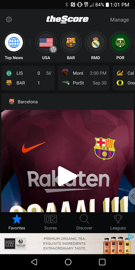
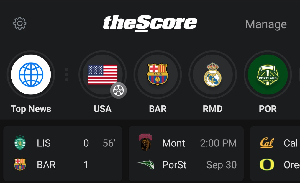
If you are in the crowd that fully hates the update, let me try to help you sort it out. I’ve found that hanging in the “Favorites” tab is the key. Obviously, this brings you all of the info on your favorite teams upfront. However, there is a hidden gem on this page in the top left corner that you may find the most useful – the “Top News” button.
That button gets you into your traditional theScore news feeds, where you can read actual content on the biggest happenings in sports. Initially, I thought this section had disappeared for good and was replaced with the “Discovery” tab, a tab that felt like theScore doing a pivot to video or social media for up-to-the-minute sports drama. And yeah, the “Discovery” tab is hard-to-read and mostly trash. So again, go into the “Top News” section from “Favorites” and I think you’ll be much happier.

From there, the app sort of makes sense. The “Scores” tab shows you the latest scores of the day, with the leagues you follow in the order you follow them. You can adjust that order through the “Manage” button at the top right corner of the “Scores” tab or through the “Leagues” tab; I highly suggest you attempt to tweak these.
Obviously, the “Leagues” tab will show you a list of the leagues you want to follow while showing you individual sections within each (scores, feed, standings, and leaders) like it always did. The layout is slightly different, but it’s all there.
And again, the “Discover” tab is mostly just a Twitter and Instagram feed of stuff theScore is hand-picking that they think is entertaining or relevant or “viral” at the moment. Some of it includes live video clips that play within the app, others are links to social media pages and top sports trending-type items. It’ll take some getting used to, for sure, but could provide you with quick highlights and other bits of info as they break.
While I think I’m not the biggest fan of the update just yet, it may take us all a while to figure out how it works. It’s certainly not as simply laid out as the previous version and that may be what is so frustrating to some of us. I’ll give it another couple of days before I do re-install ESPN’s awful white-laden app.
Other theScore users, how is the update treating you?
Collapse Show Comments30 Comments