Verizon Messages (or is it Message+?) received an update this morning that introduced the app to the idea of Material Design. Well, it at least added some vibrant colors, a FAB that probably doesn’t exactly match up to Google’s vision for a FAB, and a slideout drawer with…well I’ll just stop. Verizon Messages (or again, is it Message+?) got a big update!
I hear good things about the app…Verizon customers do use it from what I understand. So yeah, grab that update and enjoy Verizon app designers’ take on Material Design. If anything, it’s an improvement over the app’s former Gingerbread styling.
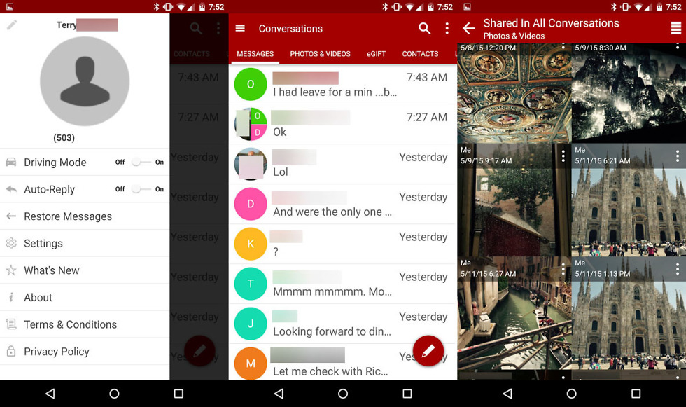
Update: Updated imagery with screenshots from the actual update, not the old ones featured on the Play listing. As you can see, the setup for the app is much different now. It still has a FAB and slideout drawer, but Verizon has gone with a column approach that allows you to swipe between things like your messages list, photos and videos sent or received, eGift cards, contacts, etc. The slideout menu has also been tweaked and is much cleaner.
Collapse Show Comments99 Comments