Last week, Google released the source code for their Google I/O app. Since the app is used as a reference for new design guidelines with Android apps, this is a pretty big deal for app developers, especially those looking to adopt Google’s newest set of guidelines, Material Design, and implement them into their own apps.
In a follow-up to last week’s release, Roman Nurik (the lead designer of the I/O app and master of DashClock and Muzei) took to the Android Developers Blog to share his team’s design thinking of this year’s app. Not only does he walk you through the thought process and changes between releases of the I/O app, he also talks about Material Design shadows, colors, layouts, grids, and more.
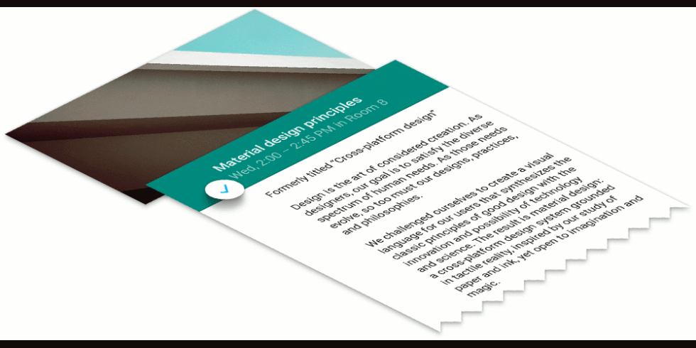
Material Design introduces massive changes to app design that I can only imagine will take time for designers to get the hang of. If you want to see and learn about Material Design, this is a must read and watch.
[responsive_vid]
Collapse Show Comments21 Comments