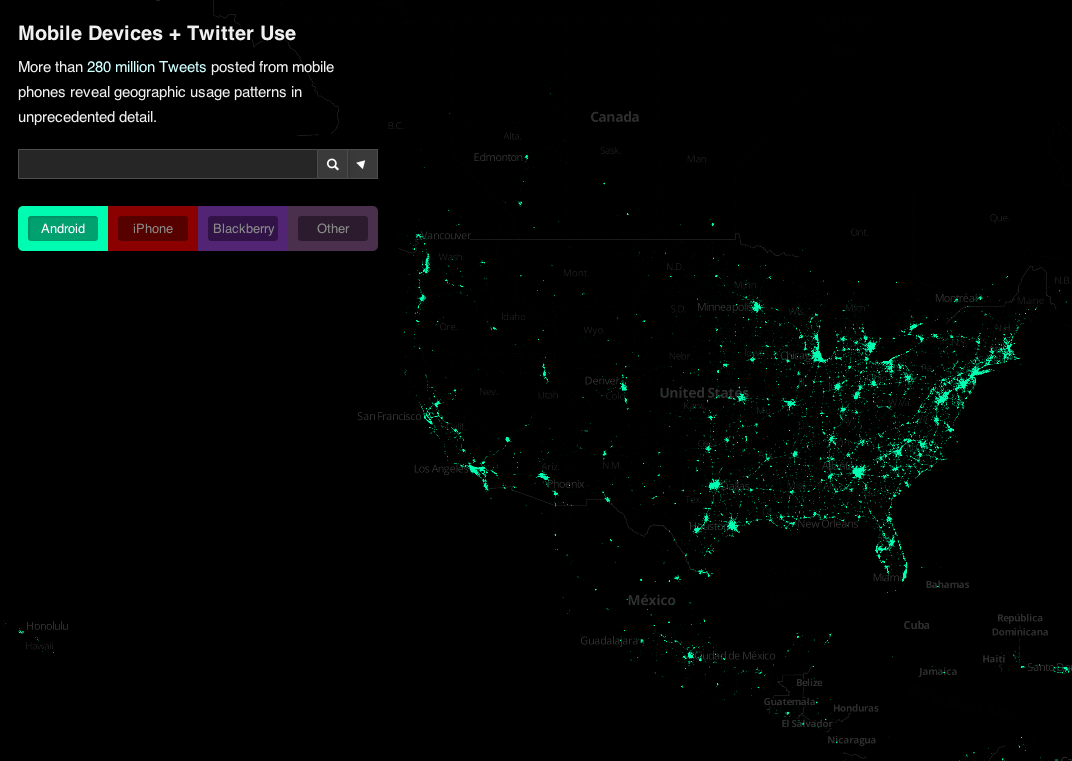
With more than 280 million tweets sent out using location services, you would hope all of that data could be used to at least make something interesting, right? A company was able to gather this information and place a lighted speck on the map for each tweet, creating a very pretty map for users to check out. What takes the map over the top is that you can toggle between views of tweets from iOS, Android, BlackBerry and “other” device individually. Plus, they can be layered. Very cool.
Follow the link below to check the map out and make sure to zoom in all the way to see where folks are tweeting from around you.
Via: Mapbox
Collapse Show Comments111 Comments