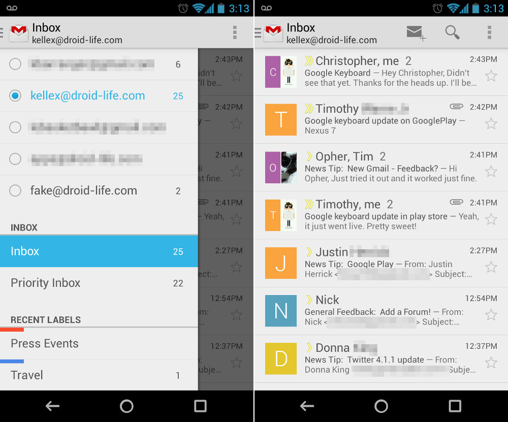
Well, now that it’s rolling out to everyone are you fans of the new Gmail for Android? The app itself is a mix of new and old, in terms of functionality and looks. Gone is the bottom action bar, in is a new top action bar. The pulldown menu for switching accounts or accessing different labels or inboxes is gone, in is a new slideout side navigation drawer. There are massive colored icons for contacts that default to big letters if you don’t have the sender as a contact, account switching has changed slightly, and you may need to tell Gmail to show either Archive or Delete buttons depending on your preference. It’s a pretty big change, while not being that big of a change – if that makes sense.
After spending the past few days with the new layout, I can say this – it’s a welcomed update, but there are tweaks that I’d love to see happen soon.
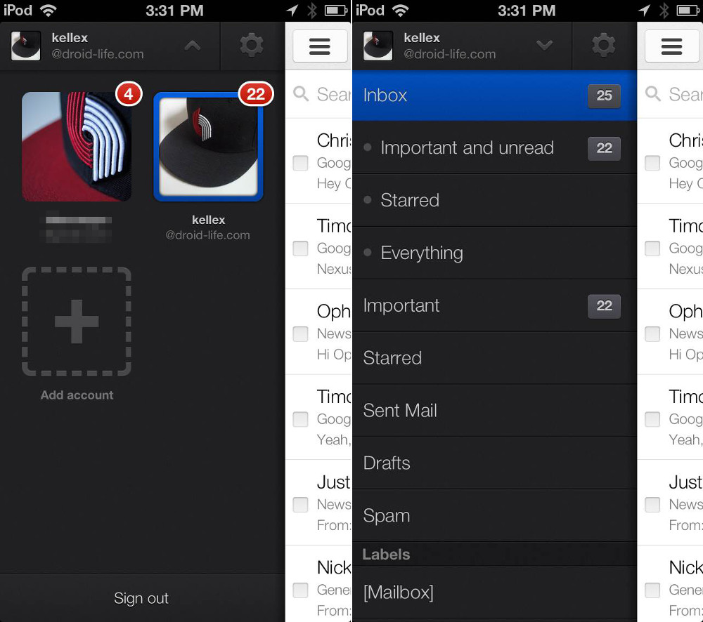
First, the slideout navigation drawer is essentially the previous dropdown menu moved to the side. That’s both a good and bad thing. On a good note, it’s much easier to access with one hand since you can swipe from the edge of your device to reveal it and not have to stretch to reach the top corner. It also shows your recently used labels, which came in handy over the weekend as I traveled and use a “Travel” label quite often. On a negative note, the top half of the drawer is dominated by my five different email accounts. While I hate to continue to compare this to the iOS version, at least the iOS version hides your other accounts in separate drop down in the navigation drawer. So when you swipe over on iOS, you get to see your current account along with all of the labels and inboxes under that account. If you you want to switch accounts, you can tap a down arrow, which opens up a tab with your various accounts.
I would love, love, love to be able to hide my other accounts unless needing to access them at the moment.
The Gmail inbox after the update now includes big, square contact cards next to each email received. On one hand, this adds some much needed color to a pretty boringly grey app, but on the other, one could argue that these massive icons take up useful space on small screens. Couple the space hogging with the fact that these icons revert to giant colored squares with the first letter of the sender’s name centered should you not have them in your contacts, and you get a confusing and unnecessary experience. Sure, the contact icon idea works in principle, assuming you have every single person that emails you in your contacts, but the likelihood of that being the case is probably pretty low. For me, I’m left with an entire inbox full of colored letters. Thankfully, you can turn them off if you want. Actually, it would be nice to have it show icons for those in your contacts, and either default to an image of your choosing or hide completely if the sender isn’t one of your contacts.
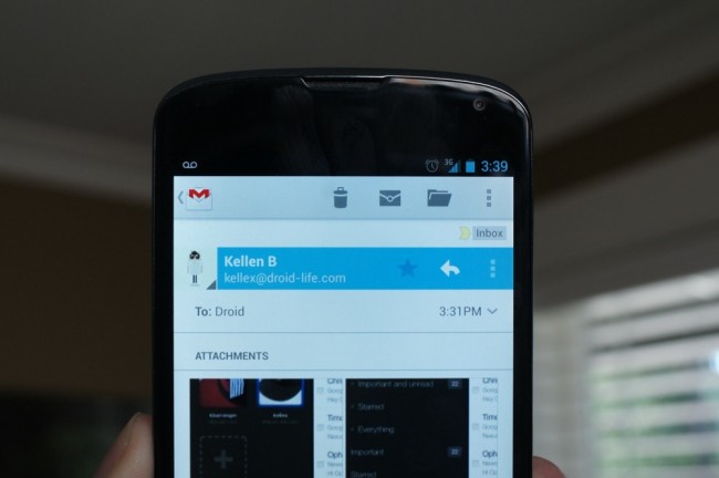
With the new update, the bottom action bar has now been moved up to the top. I’m sure this was done to create a more consistent experience across devices (like tablets) and to meet Android design guidelines, but you are now forced to reach up to the top of your phone to delete, archive, make an email unread, etc. This may be a personal preference, but I much prefer the action bar on the bottom of apps like Gmail, where you are constantly needing to access action bar buttons. Phones are only getting bigger, causing one-handed use to become a dinosaur.
Last, we need more control over almost all of the stuff that Google tweaked in this app. For example, the “Labels” button is now gone when you are in an email or the main inbox. Google decided that you probably like using Folders the “Move To” button over labels, so they hid the “Labels” button in the action overflow and replaced it. That sucks for someone like me who has never used the Folders “Move To” button in his life. I should be able to customize the action bar buttons or at least choose Labels over Folders “Move To.”
Edit: So clearly I’ve never actually touched the icon that looks like a folder because there was always an icon next to or in its place that was for moving things to Labels. It’s now obvious that you can just tap the folder icon and “move to” specific Labels, but someone explain the point in having both Move To and Labels buttons (like in the web Gmail)? That’s just confusing in and of itself. Plus, if you hit the action overflow button, there is an option to “Change Labels.” Either way, this is another change that was made that we should be allowed to control.
And on that note, your Delete or Archive buttons need to be tweaked in the general settings. Depending on the setting you left off from in the old Gmail, there is a chance that you will see only a Delete or Archive button, not both. You can tell it to show both though, the option just has to be manually set.
Oh, almost forgot to mention that you can pull-to-refresh now, which is awesome.
Again, overall I like what was introduced with the new Gmail app as a general theme, but there are definitely some changes I would like to see.
Your thoughts?
Collapse Show Comments165 Comments