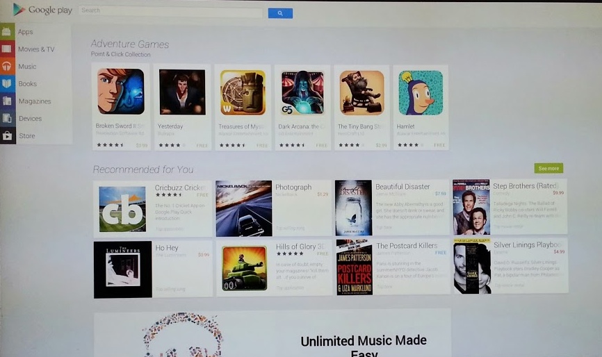
During the 3-hour long Google I/O keynote a few weeks back, Chris Yerga, the engineering director of Android, stood on stage and announced that a new Google Play layout was coming to the web store to match that of the new UI on the Android version. He would only say that it was to arrive “over the coming weeks,” and from what we can see that’s correct. The new Play store is being dogfooded to Google employees now, which you can see in the three screenshots we have included.
So like in the Google I/O presentation, these shots show off a Play store that indeed does mimic that of the Android version. It follows the tablet design more than the phone version, but that makes sense since your computer screen typically sits landscape and is larger.
We’re seeing the navigation panel constantly sit to the left, making it incredibly easy to jump between sections of Music, Apps, Devices, etc. As you drill down on one section, you’ll get options for “My Apps” or your wishlists, but then can easily get to another section through that same area.
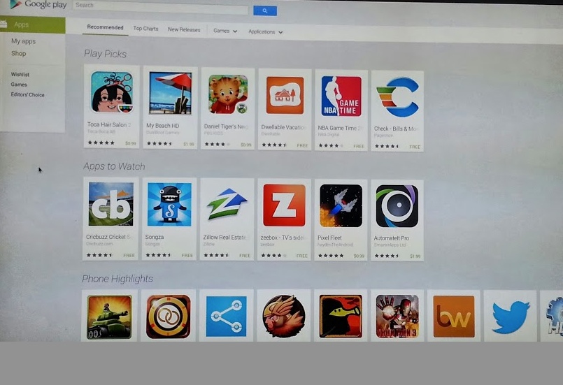
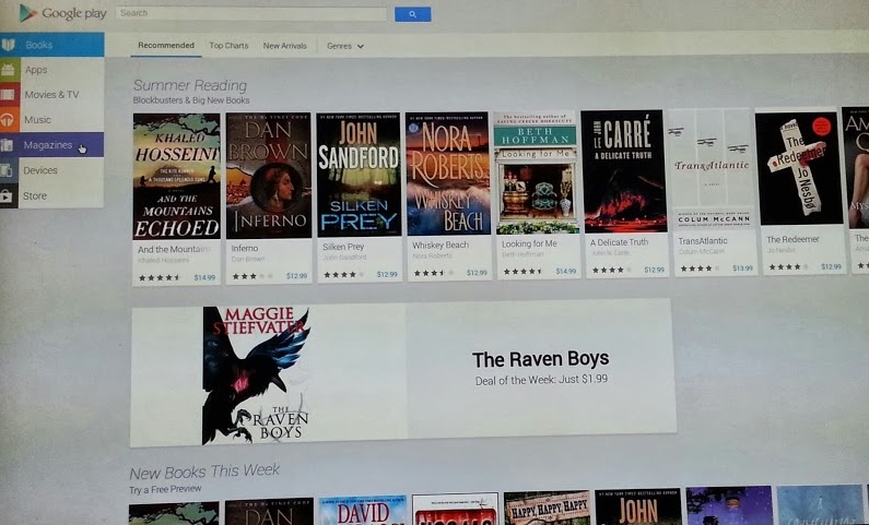
The box or card-style design for apps, movies, TV shows, and other sections is also present. There are recommended areas, highlighted content and everything you are hopefully getting used to in the Android version of the Play store.
Still no exact word on the public release, but internal testing is always a good sign that we may not be too far off. And again, we were told at I/O that we would see it in the coming weeks, which could mean any time now.
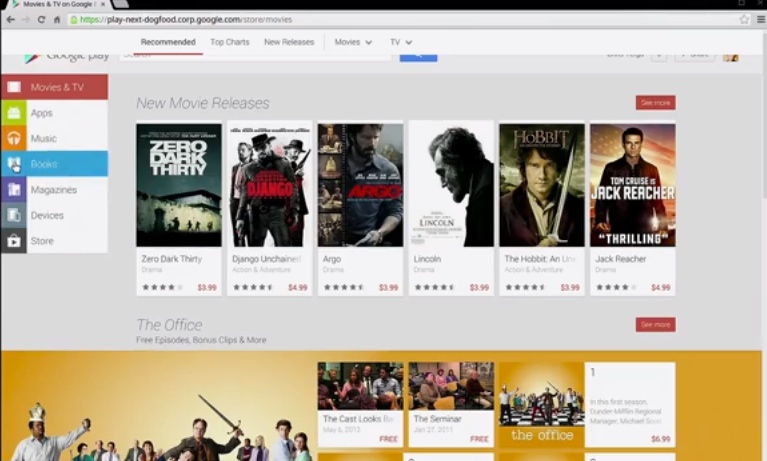
Here is a screenshot from Yerga’s presentation:
If you jump to the 38:00-minute mark of the video below, you’ll see him talk about it:
Collapse Show Comments27 Comments