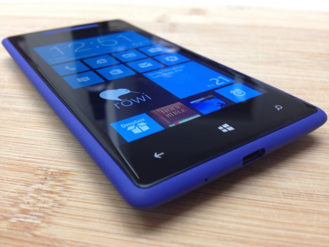
For the past week I’ve been spending a lot of time with the HTC 8X on Verizon. The 8X is considered a signature Windows Phone, sporting a 4.3″ 720×1280 display, a 1.5 GHz dual-core Snapdragon S4 processor, 1 GB of RAM, 16 GB of internal storage, NFC, dual band WiFi, LTE, Beats Audio, and an 8 MP 1080p shooter in back with a wide-angle 2.1 MP front camera. In short, Windows Phone has reached parity with Android and iOS in terms of specs.
When I last looked at Windows Phone I argued that while the operating system looks good and is certainly an improvement over Windows Mobile, the lack of apps, disappointing multi-tasking, and poor notification system kept Windows Phone from reaching feature parity with iOS and Android. Since then Android and iOS have propelled smartphone ownership to unprecedented levels while Windows Phone has remained a niche product in terms of market share. Read on to find out how Microsoft has changed Windows Phone for the better, what has stayed the same, and what Microsoft still needs to do to make Windows Phone succeed.
Software Design
Windows Phone 7 reinvented the design style that Microsoft began to push with Windows Media Center and the Zune by adding a more visual layer to a text-heavy user interface. The focus on text over images to represent UI has been slightly diminished in Windows Phone 8 with the option to shrink Live tiles down to just icons. That said, Windows Phone provides a nice balance between emphasizing text and icons at the same time.
Whether you like the stylistic choices or not, Microsoft has made an operating system that looks and feels consistent. Metro is not altogether different from the latest design choices being made by Google with Google Now, Gmail for iOS, and Google+. In fact, in many ways Windows Phone feels like what Google Now would be if it were a full operating system.
The Start screen is constantly flashing updated information in front of you in just about the right bites for you to chew. Everything looks clean and organized if not abrasively simple. Compared to the hyper-realistic design language found in iOS, Windows Phone 8 feels like a breath of fresh air even though it has essentially remained unchanged since Windows Phone launched back in 2010.
While the simplicity of Windows Phone sometimes works against its functionality, it presents a unique way to interact with the various sources of information in your life. Apps consolidate information across horizontal sections, encouraging you to explore the space. Large fonts summarize different sections of an app while icons flank the bottom portion of the screen. Again, this is not always the most functional method to display information, but it certainly makes Windows Phone stand out from the crowd. People who are looking for something that is simple but keeps them connected should find Windows Phone’s design appealing.
Start Screen
The updated Start screen was heralded by Microsoft as major improvement over the old Start screen. Microsoft is right that it is a major improvement, but it really should have been there from the beginning. In Windows Phone 7 and 7.5 you could rearrange the tiles on the Start screen, pin them and unpin them, but their size was decided by the app, not the user.
Microsoft is now giving users the ability to change the size of live tiles. This may seem like a minor change, but it’s an important one. On Windows Phone 7.x, the most amount of tiles you could see immediately after unlocking your screen was 8, whereas with Windows Phone 8 you could potentially see 28 live tiles upon unlocking your screen. This means that users can prioritize more apps towards the top of their Start screen.
The Start screen, while not tremendously different from the last iteration of Windows Phone, is far more useful now. That said, live tiles do not provide the same kind of customization or functionality as widgets. While widgets are not the superlative expression of functionality and productivity, they are often more useful than live tiles. For example, a Twitter widget can show you multiple mentions while a live tile only shows a preview of one notification (yes, you still often cannot see the full text of a notification from the live tiles).
The Start screen excels at giving users quick glances at information, but it still feels somewhat hampered by design choices that Microsoft made early on. Adjusting the size of live tiles in Windows Phone gives users the option to see more information, but Microsoft should have come up with a way to see more information on smaller live tiles. The smallest, icon sized icons will obviously be severely limited, but the medium sized icons that most apps default to could use some sort of scrolling mechanism to see more information from the Start screen. If the users wants to see everything they can always open the app, but being able to swipe through email headings or read more of a tweet than the first few words would make the Start screen far more useful.
Notifications
Notifications in general have remained completely unchanged since Windows Phone 7.5. If the screen is unlocked and an app received an update, you will see a toast notification at the top of the screen. Tap it and the respective app will launch and show you the update or swipe the update to the right to dismiss it (something iOS users are surely envious of).
On the lock screen there have been some improvements. For example, you can choose between the Calendar, Facebook, Twitter, Email, Messaging, and Phone apps to display detailed information on the lock screen with quick status notifications on the lock screen from the same group of apps. You may only chose one of those apps for the detailed notification and you can chose five of the remaining apps for quick status notifications on the lock screen. As far as I can tell developers do not have the option to tie their apps into detailed or quick status, which means the only way to see notifications if they occurred when you weren’t looking at your phone is to pin the app to the Start screen.
While some might say that pinned apps to the Start screen is just as good if not better than a full notification hub, I disagree. The Start screen is where I want to pin the apps that I used most. That is the screen that I will look at the most. While it is nice to have quick access to information from my most important apps, I don’t want the Start screen to double as a notification hub.
Notifications are a crucial part of a modern operating system. An operating system that is allegedly designed to let you get in, get out and get on with your life should have a clean, simple notification hub so users can actually see what is going on all in one place. Considering Microsoft’s emphasis on other information hubs, this omission is glaring. It would make a lot of sense for Microsoft to add a notification hub that is accessible from the Start screen by swiping to the right instead of forcing users to pin any app to their Start screen that might receive a notification. While it is nice that users can shrink down the tiles so they do not have to scroll through a huge Start screen to manually search for notifications, that is not a good solution for power users.
Multitasking
Multitasking has also remained largely unchanged. While you can now go back up to seven apps, the behavior is still inconsistent. Some apps are able to resume quickly while others are not. It is also still possible to have two instances of the same app appear in the severely limited multitasking screen. I did have some issue with the Settings app disappearing from the multitasking screen from time to time. I’m not sure if that was supposed to be a feature or if it’s a bug, but it was annoying. Multitasking is supposed to bring some consistency to your app experience, but Windows Phone does nothing of the sort.
While the multitasking screen looks nice (HTC Sense’s version of multitasking looks very similar), it would be even better if you could swipe apps away to close them. When Microsoft first revealed its iteration of multitasking on Windows Phone (yes, it actually launched without multitasking) many drew comparisons to webOS, but unlike webOS (and Android as of Ice Cream Sandwich) the multitasking screen is just to switch apps, not the manage them.
In theory, to close an app you simply relaunch it from the Start screen. Some apps like Rowi resume where you were when you launch them from the Start screen, but most apps launch a fresh instance if they are accessed from the Start screen. This sort of behavior should have been changed in Windows Phone 8. Android, iOS, and even webOS resume your session in an app when it is launched from your home screen or the app launcher. Microsoft should have just went all the way and stolen webOS’ card interface to mange apps.
Apps
Despite Microsoft’s efforts to coerce more developers to write apps for Windows Phone, the app ecosystem has not changed dramatically since Windows Phone 7.5 and the end of the smartphone beta test. Big name apps like Instagram, Tumblr, Pocket, Starbucks, Pandora (coming in 2013), Flipboard, Dropbox, Hulu, and YouTube are still missing. Sure, there are often third party apps that you can use to replace or use these services, but the fact that these kinds of apps are still missing is a huge problem.
To complicate things more, since many of these apps are unavailable in an official form, users are often forced to pay for apps that allow you to use the services instead of the free versions that would come from most of these companies. On top of that, many of the paid third party apps do not work well. There are certainly exceptions (BoxFiles for Dropbox, SBUX Card, YouTube Browser, Blueprints, etc.), but the experience is frustrating to say the least.
On a brighter note, the Microsoft has cleaned up the Windows Phone Store (formerly the Windows Phone Marketplace) so that searches bring up relevant apps. This was a huge problem back when I looked at Windows Phone 7.5, but thankfully a search for Twitter brings up Twitter apps first, then random apps that mention Twitter. Browsing through app sections like Top free and Picks for you also seem improved, offering better suggestions and a more curated experience.
While Microsoft has done a good job at bringing in a lot more big name apps and cleaning up the Store, it still has a lot of work ahead of it. With Google removing Exchange support for Gmail and refusing to make apps for Windows Phone, Microsoft is going to have to push harder to increase adoption. There are certainly plenty of great apps out there, but omissions like Instagram, Tumblr, and Pocket really do hurt Windows Phone’s image, and therefore their chances to succeed in the market.
Games
The game ecosystem has improved slightly since I used Windows Phone 7.5. There are more popular titles and a few more clones of popular titles from Android and iOS. Games are still hidden in the Games app instead of showing up with the rest of your apps. I’m not sure what Microsoft is trying to accomplish by siloing gaming apps into the Games hub, but it would be nice if there were at least an option to have games show up with the rest of your apps.
The improved hardware requirements for Windows Phone could encourage developers of heavier games to develop for Windows Phone, but games like Dead Space or Marvel vs Capcom 2 are still missing. In their place are a number of simpler games from Wordament by Microsoft to Angry Birds Star Wars to Sonic CD. While the games that I played performed well and I didn’t see any issues with games not resuming properly in my testing, the lack of titles was annoying.
The dearth of gaming titles on the mobile platform of a company that has its own console is embarrassing. The fact that there still isn’t a Halo FPS or even side scroller is maddening. Microsoft is literally leaving money on the table by making franchises like Halo console-only. I would be happier with the Windows Phone gaming options if I could at least get a decent number of classic Sega titles, but Sega only has four games available on Windows Phone (Sonic CD, Sonic 4 Episode I, Super Monkey Ball, and Super Monkey Ball 2). Had Microsoft reached deeper into their pockets, they may have been able to coerce Sega to release some exclusive titles to Windows Phone or at least to match their huge library on iOS. When a flailing company like Sega only has four games on your operating system, you know you’re in bad shape.
Camera
The camera software on Windows Phone 8 has received a number of improvements. In previous version of Windows Phone the camera had a video toggle on the top, a +/- toggle to zoom, and a settings button that opened the full settings pane. While it was a nice, minimalist look, it emphasized digital zooming a little too much considering any amount of digital zoom alone tends to distort an image noticeably.
Windows Phone 8 keeps the minimal design, but puts more useful features on the left of the display. Three dots mark the top of the right panel to drag out the full settings pane (which is much more consistent with the rest of Windows Phone’s behavior than Windows Phone 7.x’s version) followed by the video toggle, the front camera toggle, the flash toggle, and the lens toggle. Sliding out the Settings pane prompts you to chose between altering video and photo settings.
Photo settings in Windows Phone 7.x were rather minimal with a few unhelpful scenes to choose from, some effects, resolution options, metering mode, and flicker adjustment. In short, there was not a lot of emphasis placed on allowing the user to control the camera. Windows Phone 8, on the other hand, offers some of the same effects and resolution options, but adds white balance, exposure, contrast, saturation, sharpness, and ISO controls as well as the option to enable or disable face detection. While you obviously still dont’ have the kind of manual control you would expect from a full fledged camera, there are a lot more options available to enable you to take better shots.
One other neat feature in Windows Phone 8 is the ability to add third party lenses. Bing Vision (which is a barcode/QR code reader) comes built in, but other lenses are available in the Windows Phone Store. One free option, CamWow has a number of filters that can be live previewed and used to take goofy shots with swirling or pinhole or more serious shots with a black and white filter or stencil lens. While many of these are built into Windows Phone, the option to have third party developers build lenses that can be used straight from the camera app is great.
Maps
The maps experience will differ from device to device. On the 8X I had the built-in Maps app which is designed by Microsoft, but powered by Nokia Maps (much like the Maps app on iOS 5 and before was designed by Apple, but powered by Google Maps). On Nokia devices you will have their Nokia maps app as well as access to Nokia Drive, a voice navigation app with turn-by-turn directions. While Nokia drive will eventually be available to other devices, right now it is a Nokia exclusive, leaving the 8X with the VZ Navigator app (which appropriately is currently rated 2 out of 5 stars).
Overall the design of the Maps app is identical to before. You have access to an arial view (satellite), turn by turn directions, local scout for points of interest, and traffic conditions. Once nice little addition to the Maps app in Windows Phone 8 is the option to display WiFi hotspots. While that sort of information is not super relevant for most consumers, it’s a nice addition.
When getting directions in Windows Phone 7, tapping on each section of the directions would change the visual map and read out loud what the next step was. While tapping to see the next step is still enabled, voice over is gone in Windows Phone 8. This is undoubtedly in preparation for Nokia Drive to be made available to all Windows Phones, but in the mean time it means that non-Nokia Windows Phone 7 devices are actually better for navigation than non-Nokia Windows Phone 8 devices. It would have been nice to see Microsoft at least leave the old functionality in the app until Nokia Drive was released instead of abandoning users to VZ Navigator.
Overall the maps were accurate in my usage, but far less useful than Google Maps. In fact, I would prefer Apple Maps to the mapping solution provided with the HTC 8X. While Microsoft has touted Local Scout to find points of interest near your location, that data is not present by default when browsing through maps. Points of interest can be shown by tapping on Local Scout or initiating a search, but I had issues with some locations missing. In particular, my favorite Starbucks in my home town is missing altogether in Nokia Maps (it is accurately presented in Google Maps and on the wrong side of the street in Apple Maps). While Apple Maps is often derided for misinformation, I could have still seen the Starbucks from the street with Apple Maps; Nokia Maps doesn’t even acknowledge its existence.
Office
Microsoft Office has remained useful if you use SkyDrive, but not very useful otherwise. You can still create and sync Excel sheets and Word documents. You cannot make a PowerPoint presentation on your phone, but they will open and you can make some small edits. OneNote has its own app which does a good job syncing between the full desktop application. In fact, if you’re a student who relies on OneNote, the Windows Phone application is really nice.
For whatever reason Microsoft continues to tout Office as a huge advantage for Windows Phone users, but the reality of the situation is that Office for Windows Phone is only marginally better than Notepad on Windows or TextEdit on OS X. To make matters worse, Google offers Drive for free on Android and iOS with even more functionality than Office. Even Apple’s Pages, Numbers, and Keynote, which are $10 each, blow Office for Windows Phone out of the water. This says nothing of the other full productivity suites available on Android and iOS like Documents to Go and QuickOffice.
Most people are probably not using their phones to make major changes to documents, but at least on Android and iOS you have the power to do so. Sure, on a Windows 8 device you have the option to have the full Office experience, but it still isn’t really optimized for touch and it doesn’t deal with mobile emergency: having to make a major change to a document and not being able to on a Windows Phone. Considering how much Microsoft is pushing Office as a competitive advantage over Android and iOS, I would have hoped that they would have improved the Office experience instead of making it feel like a free trial.
Email, Calendar, Contacts
The email, calendar, and contacts experience remains relatively unchanged. Despite a larger, higher resolution display, the 8X still only displayed my most recent 5 emails (the same as my Trophy running Windows Phone 7.5). Apparently Microsoft employees don’t use email that often and think that 5 is an appropriate number of emails to display. Most of the display is taken up with giant text for each sender. The design is reflected in Outlook 2013 as well with giant text for the sender and regular sized text for the email preview (something I was able to disable in Outlook 2013, but not in Windows Phone 8). For casual users that might be fine, but for a business user (which should theoretically be a huge demographic for Microsoft), they want to be able to see as much information as possible.
Once you open an email you’re greeted with a large avatar for that user (provided you have an image in your contacts for that person), their name in giant text yet again, the subject in blue, regular sized text, followed by the metadata for the email and then the email’s actual text. Emails sent in HTML are squished to fit into the size of the display, which often means that portions of the email may be cut off or formatted incorrectly. Pinch-to-zoom is enabled, but it does not solve the problem of emails displaying incorrectly. Even turning the phone to landscape does not resolve the issue. This is an issue that has persisted since Windows Phone 7 and is yet another area that Microsoft, the company behind Exchange and Outlook, absolutely should have resolved before.
The Calendar app is a nightmare. It defaults to a day view, where you can scroll through each hour of the day to see what is going on today. A swipe to the left shows your whole agenda (which is actually useful) and another shows you your To-Do list. There is no week view. You can switch to a month view, which uses a .5 size font to let you know that something might be happening on a certain day, but in order to view anything you have to press on that day, leaving the month view.
This isn’t all that different from the stock Android calendar app, although at least there you have some semblance of a week view. Samsung’s calendar app on the Galaxy S III, while ugly, replicates the functionality of the calendar app in iOS, which gives you a month view in which you can select a date and see the day’s events all in the same view. There are third party apps in the Store (Live Calendar and Calendar[+] are both good options) that provide this functionality to make the calendar app more useful, but the built in app is essentially only good for its agenda view.
The People hub is essentially unchanged from before in terms of managing and browsing contacts. For casual social network users this has the potential to keep you posted on what your close friends are up to if they use Facebook and Twitter regularly. The idea is that it can be a one stop app to show you the important things going on in your friends and family’s lives. In my own practice I found it was easier to keep up in third party apps than to rely on the People hub, but again, this is clearly designed for casual social networkers.
One neat new feature for a group of friends or a family with Windows Phone is Rooms. Rooms is a new feature in the People hub that allows you to communicate with a group of people through chat, a shared calendar, photos, and notes. The app is clearly tailored towards families (the examples given are overtly family related), but it could be useful for other groups of people to stay in touch (like classmates working on a project together). While business users will probably still rely on Exchange, I can see where this sort of funcationality would be really beneficial for a family of Windows Phone users to keep track of everyone’s schedule.
Conclusions
Microsoft has taken some important steps towards creating a competitive operating system, but they are still far from reaching parity with Android and iOS. The lack of apps, subpar multitasking, and abysmal notification system are three major issues that Windows Phone has faced since its launch. The app situation is improving, but I wouldn’t call it hopeful. Huge parts of the operating system feel like they were designed for Windows 8 on a desktop because they require so much visual area, which leads to little content and lots of blank space (which is also an issue in many native Windows 8 apps).
Windows Phone feels like a suped up feature phone with full access to the web and a few apps. For users who are loosely connected to others through social networks, want a decent camera, and don’t play a lot of games on their phone, Windows Phone could be a great solution. For most people, however, Windows Phone is simply too different from the competition. It’s not that people won’t appreciate the look and feel of Windows Phone (in fact I think most people would enjoy it), but rather that Windows Phone behaves irrationally compared to industry standard UI paradigms and lacks important apps.
Like I said the last time I reviewed Windows Phone, I would love for a third operating system to truly compete with Android and iOS, but Windows Phone simply is not that operating system right now. Microsoft may have incredibly deep pockets to keep investing into Windows Phone, but the longer it takes for them to reach parity, the more users are choosing different ecosystems. As it becomes increasingly more difficult to leave an ecosystem and as we continue our march towards smartphone ubiquity, Microsoft is going to have a much harder time penetrating the market in any significant way.
When trying to enter an established market there is a temptation to do something totally different, but making something too different means having to retrain users. The shift from a command-line interface to a graphic user interface meant having to retrain users how to use computers. Smartphones required a similar retraining, with iOS setting the ground work and Android following along shortly thereafter. While there are important differences between Android and iOS, both follow the same basic UI patterns and ideas. Microsoft elected to take a radically different path which enabled them to stand out from the pack, but it also created a larger barrier to entry than iOS or Android present to the average user. If Windows 8 tablets take the tablet market by storm then Windows Phone will undoubtedly feel more natural to more users, but until then it faces an uphill battle in reeducating users how to use a smartphone.
It is discouraging that after two years of trying Microsoft still has yet to really break into the market, but the reality is that Microsoft has not put in the work it needs to in order to make Windows Phone a success. Microsoft is going to have to work much, much harder if they want to push themselves into an already crowded market. Perhaps by the launch of Windows Phone 9 Microsoft will finally have a competitive operating system.
*Editor’s note – Yes, this is a post about Windows Phone. And yes, this is an Android site. We also like to look closely at the competition and share our thoughts on it. No, we aren’t going to start covering Windows Phone or iOS or Blackberry on a regular basis, but when something new comes out, we typically like to check it out.
Collapse Show Comments98 Comments