
I just have to start this off by thanking everyone for all of the ridiculously amazing submissions. We had over 125 logos entered into this contest and the decision to choose a winner was more difficult than I had ever imagined. It was obvious from the beginning that you all understood the look we were going for without even giving you many instructions, so I want to applaud all of your efforts. We easily have the most talented group of Android enthusiasts on the planet. Amazing work everyone.
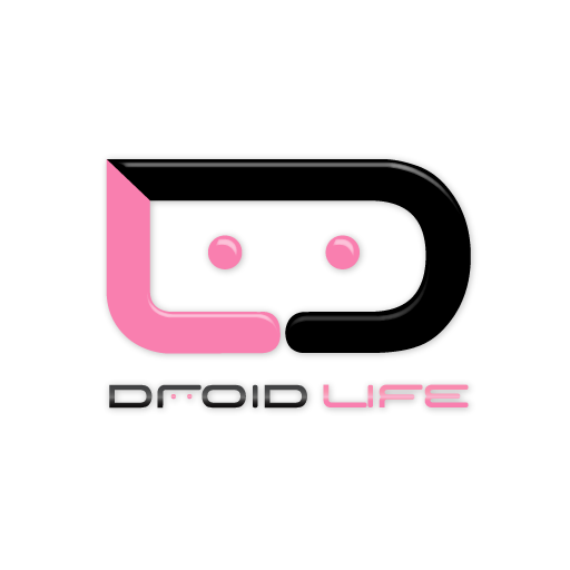
And with that said, we were unable to pick just 1 winner. As you can see above, we have two logos on display and have chosen them as co-winners! One is a fun, 3D, in-your-face Android beast, while the other fits perfectly into our obsession with all things minimalist. They might be on complete opposite ends of the logo spectrum, but they are both in a weird way, exactly what we were looking for.
Everyone give a solid fist bump to Christopher (left logo) and Wayne (right logo)!
The original prizes were an Android mini-collectible and an ezeStand, but to let them know how much we love and appreciate their work, we’ve decided to toss in some cash as well. Great stuff you guys!
So going forward, you’ll see a lot of testing of both logos as we decide how best to implement them.
What do you guys think?
Collapse Show Comments144 Comments